General workflow:
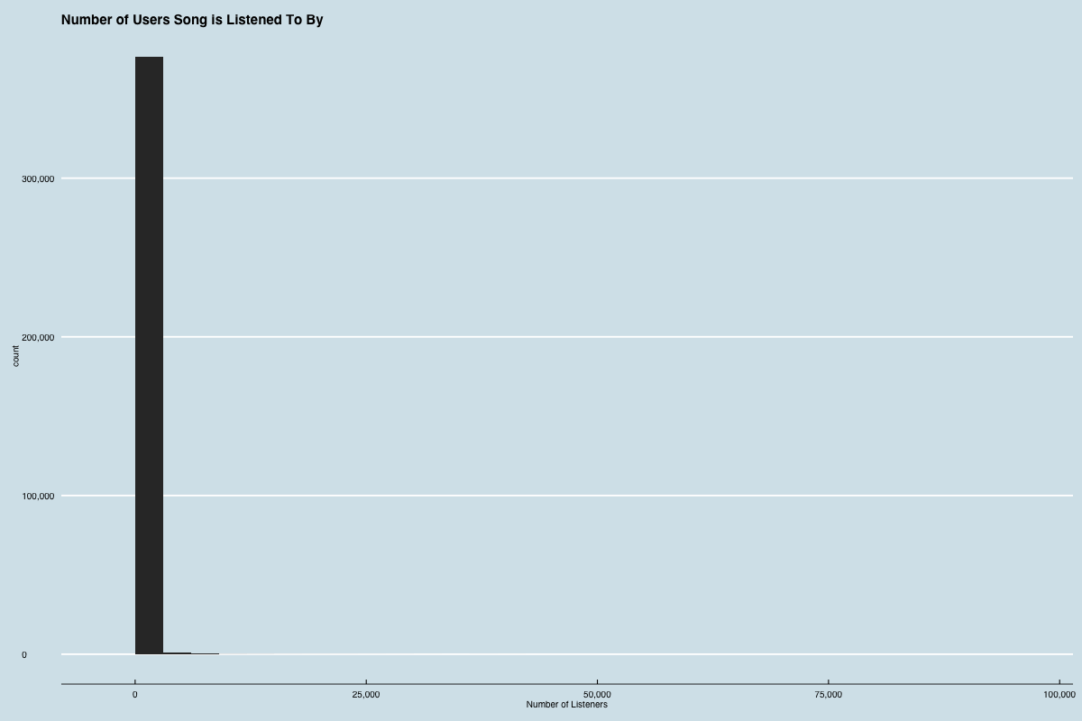
Counts collected:
Basic analysis:
takeaway: Most songs not played very often. Some have been heard by a lot of folks. Mean is skewed by the long tail.
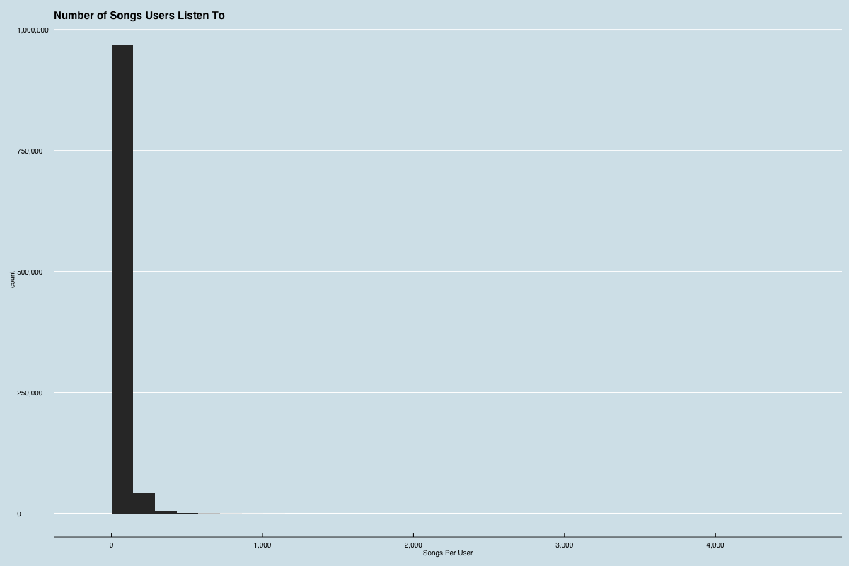
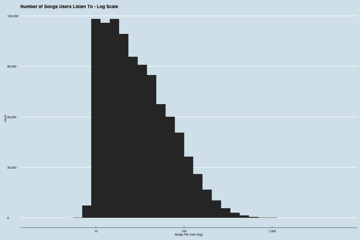
takeaway: most users have listened to 10 - 100 songs. Some power users have listened to many more.
what happens when we plot the number of songs a user has listened to vs the total number of play counts for that user?
dot for every user. x-axis is number of songs user listened to. y-axis is total play count for user.
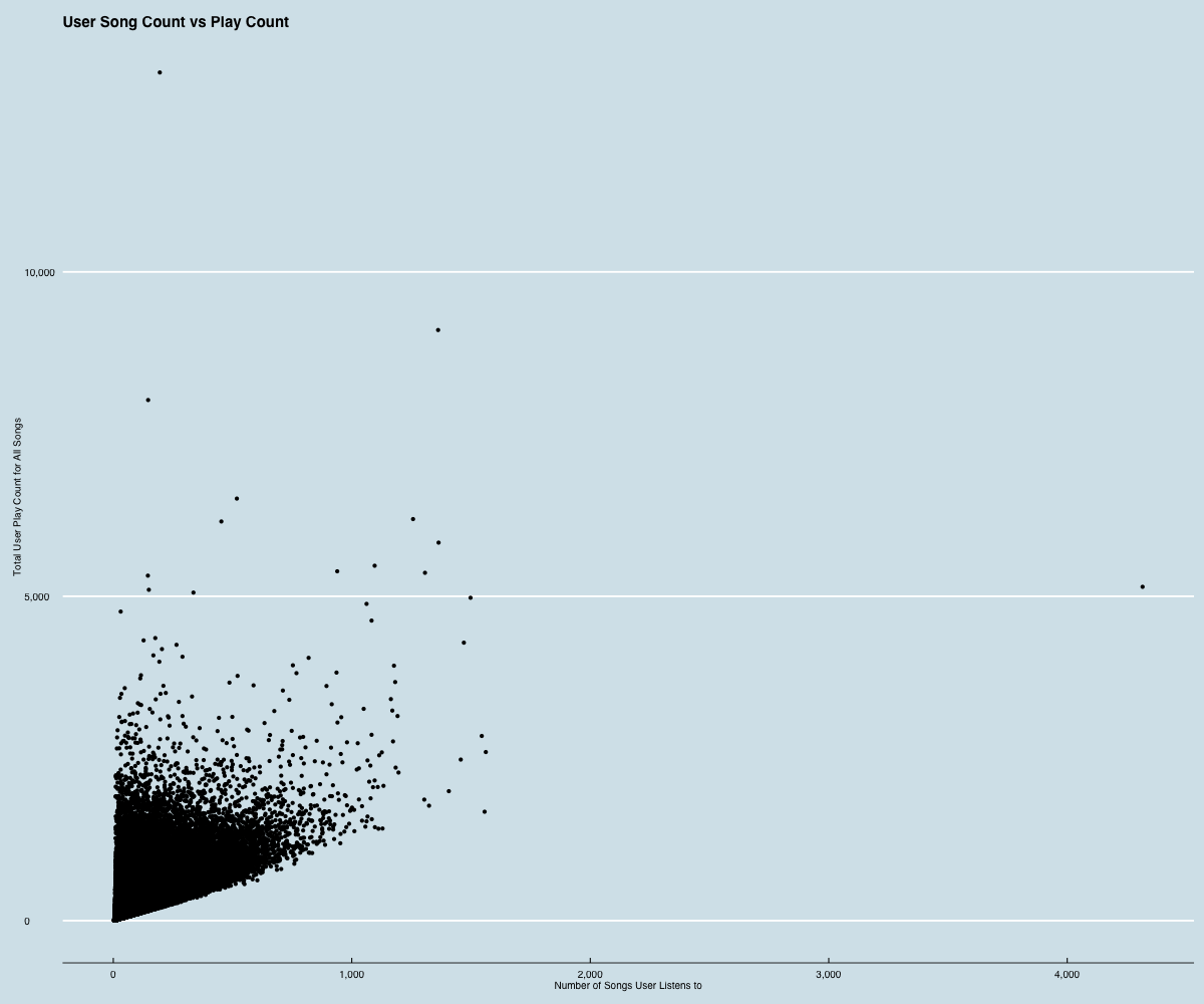
takeaway: Most users listen to a few songs a few times. Some users listen to a ton of songs only a few times. Some listen to very few songs many times.
what happens when we plot the number of users a song has been listened to by vs the total number of play counts for that song?
dot for every song. x-axis is the number of users listened to the song. y-axis is the total play count for song.
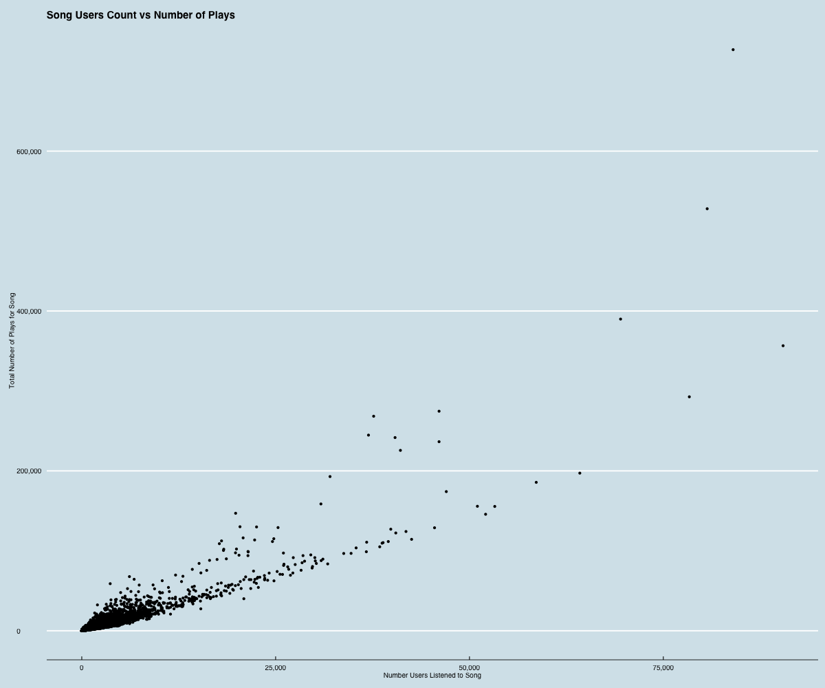
takeaway: two trends: songs that are heard by many people - but only a few times. These are popular songs that aren’t worth listening to very much.
songs that are heard by many people - and most listen to the song many times. These are songs that seem to have some staying power - users listen to them a bunch.
could be just a few users listening to these songs a whole bunch? Possible - but unlikely given the previous graph that very few users have very high play counts.
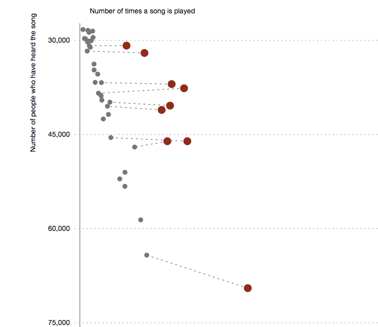
what makes these songs in the higher trend stand out from songs that have a similar number of users?
Use raw play counts. Connect matches with straight lines
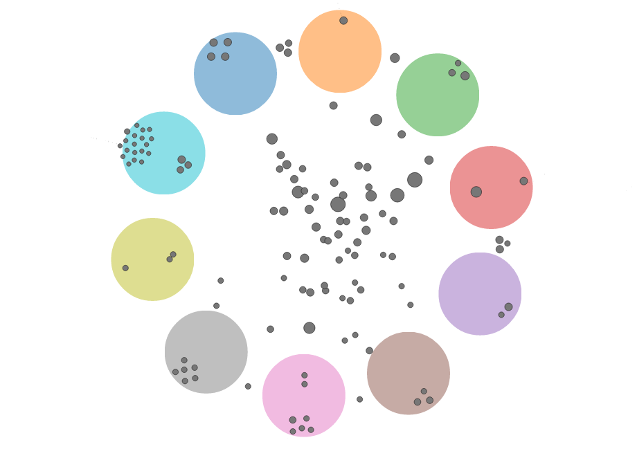
collapsible. similar to:
prototype:
collapsed - just tags:
expanded with songs:
problem: many songs have many different tags. Don’t work well with tree structure.
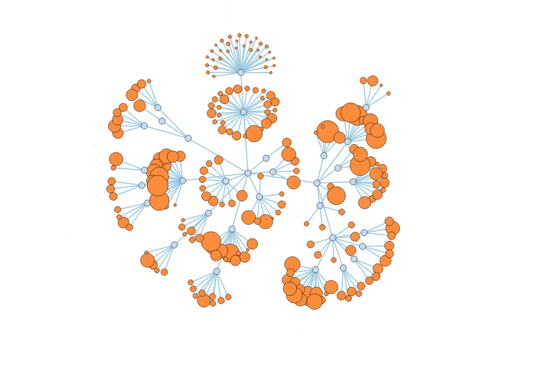
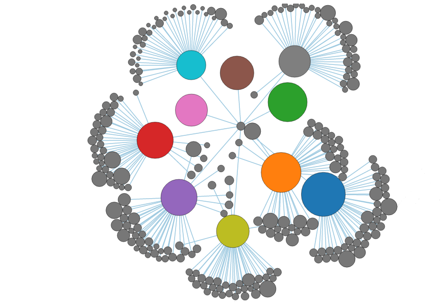
Similar to traditional force-directed network.
problem: becomes hairball fast.
avoid showing all connections at same time
keep tag nodes in consistent location
problem: difficult to see what is going on. difficult to compare between tags.