SeriesHeat
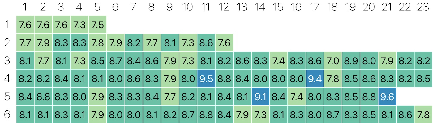
Using data from IMDb, this project allows people to explore average ratings of any TV Series made. Simply type in a TV Show and get a heatmap of seasons vs episodes. Its just that easy! The visualization approach was inspired by a static display showing how Simpson's episodes had degraded over time. Here, I wanted to expand that insight to any show out there.
Good Governments Help People Succeed
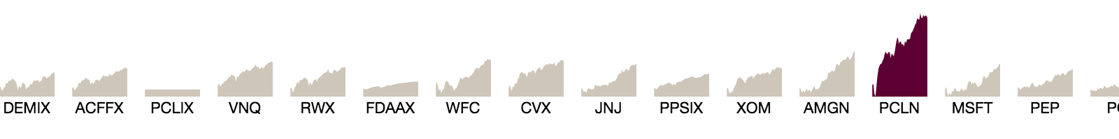
My entry for the World Data Visualization Prize. This interactive provides a way to explore countries through metrics related to both country power and progress, as well as individual human growth and opportunity. Through the use of lots and lots of connected scatterplots, we find that governments can achieve success in being good for both the individuals being governed, and good in the amount of wealth produced.
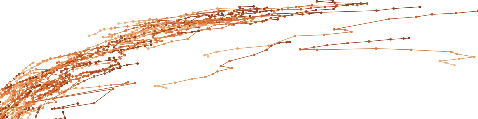
Process Simulation Animation
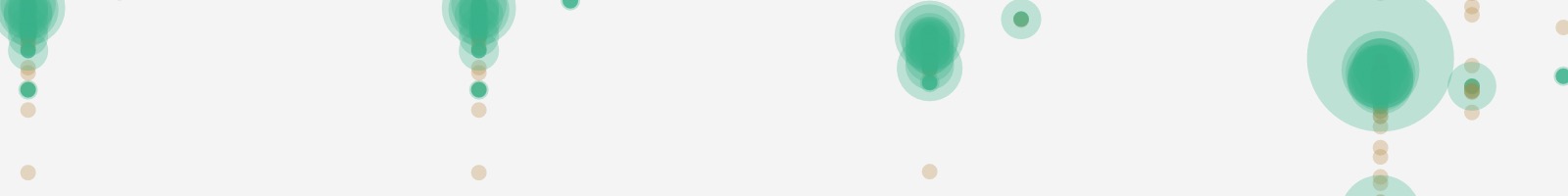
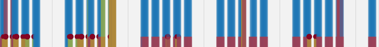
How can we explain complex processes where items move between many different categories? One way is through animation! This ambiguous visualization shows an example of many particles moving through multiple phases of a process at different rates.
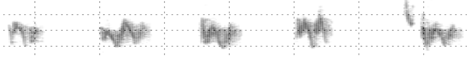
Quick Draw Visualization
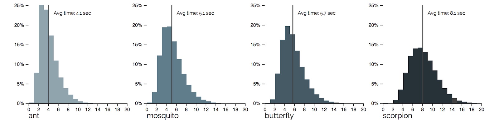
A fun visual exploration of the Google's newly released Quick Draw dataset. This work focuses on the amount of time doodlers spent drawing a variety of draw categories. Check it out to enjoy the linked histograms and be surprised by the results!
HMS Cancer Browser
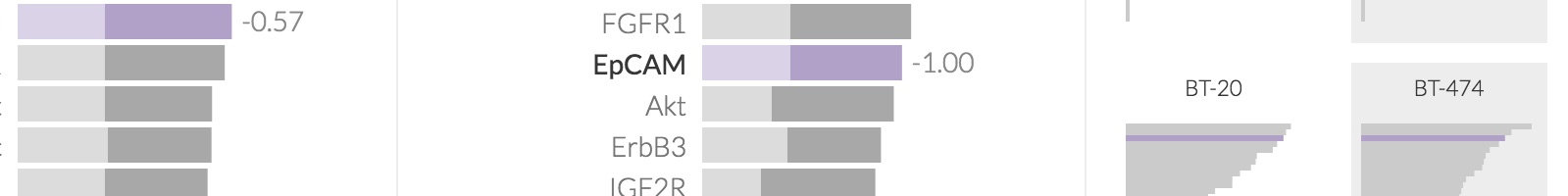
Bocoup Collaborated with the Harvard Medical School to create an interactive tool for exploring and connecting a number datasets around various types of breast cancer cell lines.
We were able to quickly create a functional tool that is expandable enough to allow for additional datasets to be added in the future. It was a lot of fun working in the bioinformatic domain, creating an interactive tool for scientists to use to discover novel connections between drugs and cancer cell types.
Kung Fu Film Data Exploration
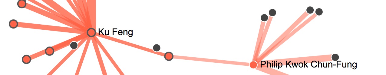
This data exploration project looks at the rich and complex history of classic Kung Fu films from the Shaw Brothers film studio. This non-serious dataset is used to demonstrate a number of techniques: Using R for data exploration and analysis, creating interactive networks of social graphs, and using Word2Vec for a bit of text generative fun.
Measurement Lab Visualization
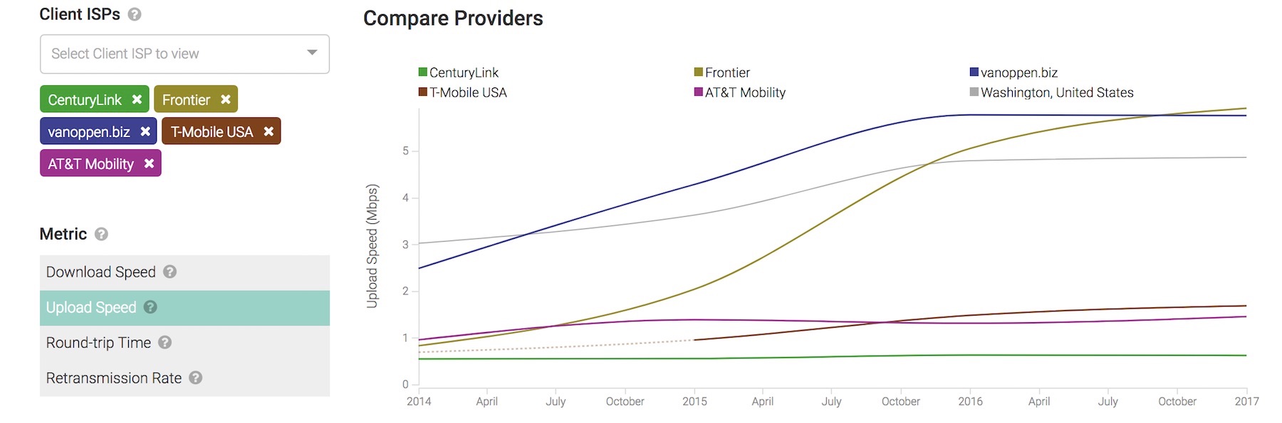
How do you visualize the "Health of the Internet"? That was the challenge posed Bocoup Data Vis by the non-profit Measurement Lab. To answer this question, we got a chance to flex our Big Data chops, needing to aggregate over 800 million Internet speed tests into city, state, and country level statistics. We used BigQuery, Google Dataflow, and Bigtable to query, wrangle, and store the data needed to power this visualization. The end result is an interactive tool that can be used by consumers and researchers to explore, discover, and research Internet help problems.
NP Legends

This experiment started with that age-old question: "What symbols are used the most often in National Park maps?"
I know you, like myself, have had this thought in your head at least a dozen times in your life. NP Legends serves to begin to provide an answer on this very important topic.
OpenVis Conf Tweets
What are folks tweeting about OpenVis Conf speakers? What content from OpenVis Conf speakers is most popular?
Web of Speakers
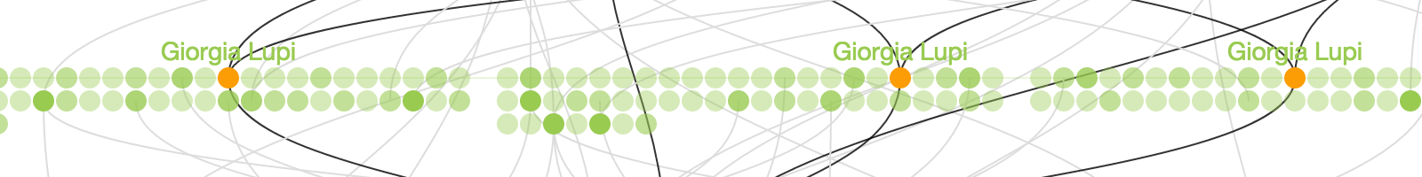
What is the relationship of all the data visualization conferences? A web of speakers!
TextArc in D3
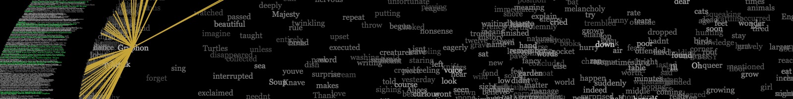
Awhile ago for fun I implemented part of a classic text visualization using JavaScript. Check it out here!.
Buoyant Microservice Prototype

As part as my role as a data visualization and open web engineer at Bocoup, I got a chance to to work on a prototype for visualizing network traffic and communication channels in micro-service networks to be used as part of Buoyant's Microservice Tools. Read more on our case study.
Experiments!
Check out my new section of incomplete, unrefined, but still fun visualizations. Experiments!
Who knows, you might find something you like.
Stereotropes
A piece by the Bocoup Data Vis Team, which I am fortunate to be a part of. Stereotropes looks at the words used to describe film and TV tropes and visualizes this language along gender lines. This free-form exploration of adjectives and gender provides interesting insights into what these tropes mean to us when they are used. Also, enjoy our Stereotropes design post, which covers a lot of how we approached this topic and how the visuals came to be.
Vintage Bump Chart in Code
Implementing classic visualizations is always a fun experience for me - and this crazy bump chart was no exception! The visualization was produced originally for the US Statistical Atlas of 1890 by Henry Gannett and shows the top cities by population, with data from over 100 years! Lessons learned from implementing this can be found in my writeup on Bocoup's blog.
Web Audio Spectrograms
Bringing bird song visualizations to the modern web!
This is an exploration of the HTML5 Web Audio API for the use of visualizing bird songs and other sounds using a spectrogram. Spectrograms are an interesting way to visualize audio over time - and this project let's you create spectrograms on the fly - in the browser!
Seattle Atlas
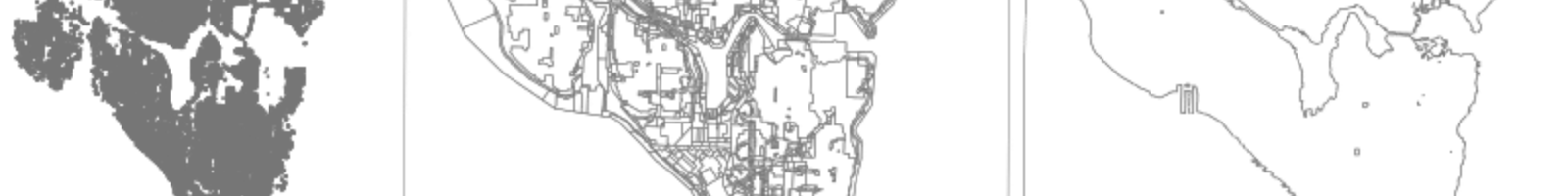
A little project to try to bring together many potential data sources for making maps about and for the city of Seattle.
Not a full visualization, but the start of a toolkit to make maps and other visualizations, Seattle Atlas uses the power of Make to allow for easy downloading and conversion of shapefiles and data from a variety of sources.
Sentence Drawings

Stefanie Posavec is known for her manually curated and hand drawn visualizations that illuminate variations of structure and form in great works of literature.
In this remix, automation is used in place of thoughtful analysis to recreate a selection of her First Chapters, in which a layout technique she calls "sentence drawings" is used to display the first chapters of classic books. Implemented in D3.
Interactive Small Multiples
Another FlowingData tutorial! This time around building interactive small multiples in D3.
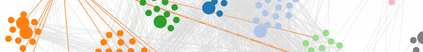
Track Tag Love

An experiment that allows users to explore their most-listened to songs, and the tags associated with these songs. User names are faked - but the rest of the data is real. User-song play counts come from the Million Song Dataset. Tag data comes from Last.fm.
Visualization includes a force-directed layout with tag nodes suspended in a circular orientation. Song nodes are drawn towards the tags they are associated with. Also enjoy the dot plot and interactive slopegraph!
Everything Is A Remix

Just in case you need a simplified, animated version of the iconic The Basic Elements of Creativity visual, here you go!
The quote and original inspiration come from the wonderful video series by Kirby Ferguson of the same name.
Remix this and enjoy!
Dallas Neighborhood Comparison Tool
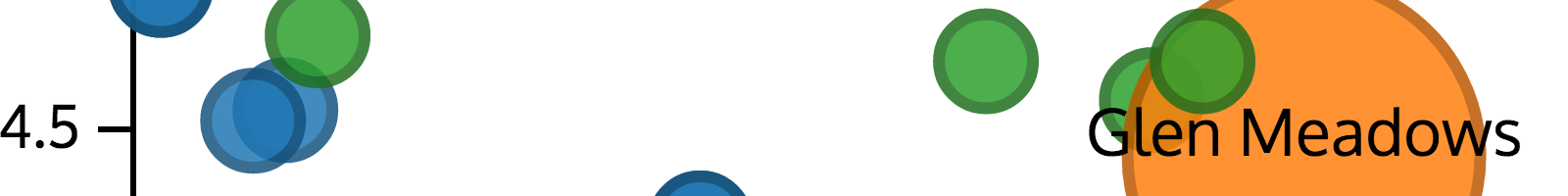
I was asked to contribute to an online interactive piece for the Dallas Morning News that allowed readers to compare Dallas neighborhoods on a number of different metrics.
This piece provides both scatter plot and interactive map, allowing the user to zoom in on one of over 500 neighborhoods in the metro area. An accompanying piece allows users to discover neighborhoods that best match their tastes over a number of factors.
Transitions Between Charts Tutorial
Another Flowing Data tutorial! This tutorial is again combined with a demo of animating between chart types in a visualization
The data for this demo was aggregated from New York City 311 call requests. Here, we look at the requests around the time of the Sandy Hurricane of 2012 from different perspectives.
Interactive Network Visualization Tutorial
This tutorial was written for the popular data visualization site Flowing Data. The tutorial is paired with source code and a demonstration site for building an interactive network visualization
The data used to demonstrate this type of visualization is song similarity data from last.fm. The visualization includes the ability to search for songs, filter based on song popularity, and change the layout of the visualization.
Small Multiples With Details On Demand
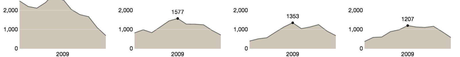
Small Multiples are a powerful way to display changes over time. In this experiment, I look at an expansion to the basic small multiples idea by adding interactive overlays for showing details of a particular small multiple.
In this example, we look at CO2 emissions over time. However, the methodology demonstrated could be used in any small multiples visualization where additional information on individual graphs would be valuable.
Bubble Cloud
Based on the NYT's convention word usage visualizations, this bubble cloud visualization provides an interesting alternative to the traditional word cloud.
Custom forces provide a unique user experience. Bubbles can be clicked and moved around for more interactivity.
The Bubble Cloud Tutorial goes over the details of the implementation.
Animated Bubble Chart

This simple visualization was made as a demonstration of how the New York Times Budget Chart works.
Each bubble represents a grant from the Gates Foundation given to an educational system. Fluid animations are used to transition views from a single group to multiple groups based on year.
The Original Blog Post describes how its done.
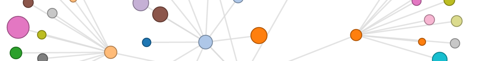
Stowers Collaboration Network
This interactive network visualization explores the relationships between individuals and groups at the Stowers Institute for Medical Research.
Each connection represents a research paper collaboration between scientists. Scientists are grouped by what lab they are a member of. The user can move groups and individuals around to explore relationships between labs.
The network was featured as a special in both online and print forms of the Stowers Report - Spring 2012. Source code can be found on github
GSA Lease Dashboard
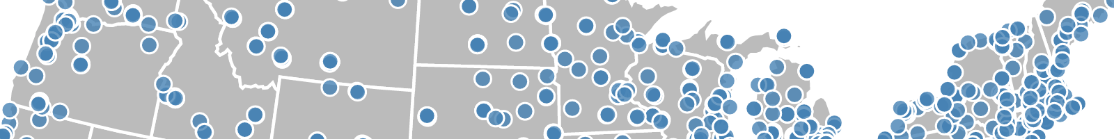
Developed for Colliers International for their Capitol Markets blog, this interactive dashboard allows for the exploration of government leased properties based on important factors.
Custom sliders allow users to filter over 5,500 GSA properties in the USA. Locations are displayed on an interactive map and metrics for the filtered properties are automatically updated.
Feltronifier For Maps

A fun little web-app that allows you to make custom Delaunay-style maps in the tradition of the Feltron Report.
Add new points, change the background and annotation colors, modify the annotations, and then save the resulting visualization for later. Uses D3.js and a number of jQuery plugins to make magical things happen.
We're In The Money

How much do the movies we love make? How about the duds we should have missed? This visualization allows the user to explore the relationships between film budget, profits, and user ratings. Search through Hollywood films from 2007 - 2011. Filter based on genre and story type.
Created for and using data from the Information Is Beautiful Awards Movie Visualization Contest. Works best in Google Chrome
Visualizing The Racial Divide
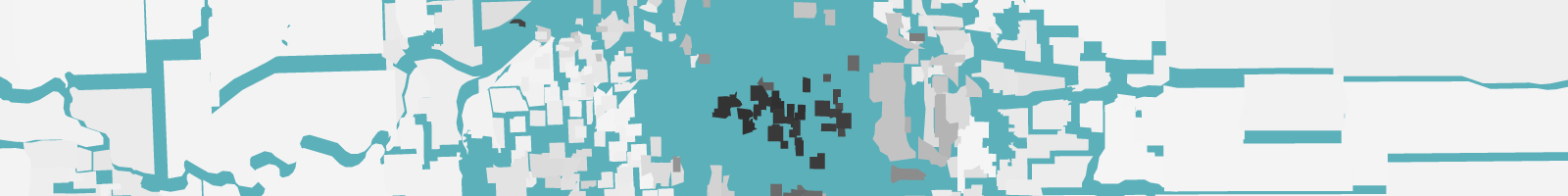
An interesting use of force-directed graphs combined with geographical maps: the force-directed map. Used here to create a visual representation of how segregation in U.S. cities affects communities today.
Areas with sharply segregated boundaries push away from each other, while areas of homogeneity stay largely static
The Original Blog Post describes the visualization in more detail. Uses d3.js and looks best in Google Chrome.
Earworms vs Humdrums
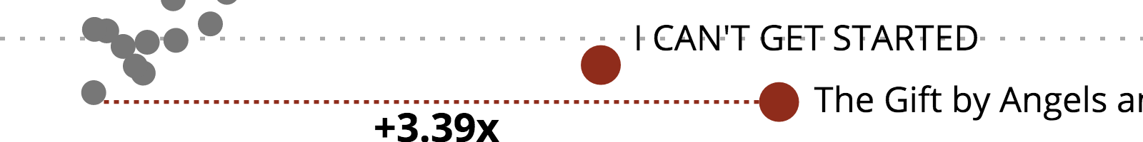
As part of the initial analysis for Track Tag Love, I created this simple chart which attempts to compare between songs that are heard relatively few times - given the number of people who have listened to them, and songs that are listened to many times by many users.
I didn't come to any startling conclusions - and so the analysis was not furthered. However, the light use of interaction to increase annotation and emphasize might be worth exploring further in the future.
Old Visualizations Made New Again
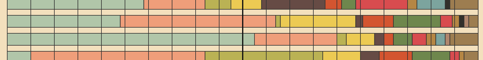
A selection of charts from the turn of the century recreated using d3.js. I wanted to get a chance to practice basic visualization techniques using d3, as well as learn a bit of coffeescript in the process. I am also fascinated with America's past. Thus, recreating old visualizations using modern technologies seemed like a good fit.
Here is my original blog post on this visualization.
With these recreations, I attempt to stay true to the original design. Because the process of extracting the raw data out of the original graphs is rather labor intensive, not all the data points are displayed in these updated versions. Also, because of the manual process, values might not exactly match the originals. Visualizations look good in Chrome and Firefox 4.
License Usage Dashboard
Managing licenses for shared applications, and knowing when to add more licenses can be tricky. This dashboard satisfies a need of knowing how often the licenses for a particular piece of shared software, Matlab, were being maxed out. Matlab has an interesting license structure in which each package has their own number of licenses - independent of the overall Matlab licenses. So there was a need to track each package's license separately.
This simple dashboard provides an overview of when licenses are being used, when these licenses are being maxed out, and who is using these licenses.