UPDATE (07/04/2018): The amazingly talented Eren Cakmak has contributed a significantly updated version of spectrogramJS. This new version uses D3v5, has zoom capabilities, and allows you to specify a color scheme for your spectrogram. Thanks so much to Eren for these contributions!
Bird-based Visualizations
Recently, I rediscovered a wonderful book on my shelf, which ended up sparking a bit of visualization exploration.
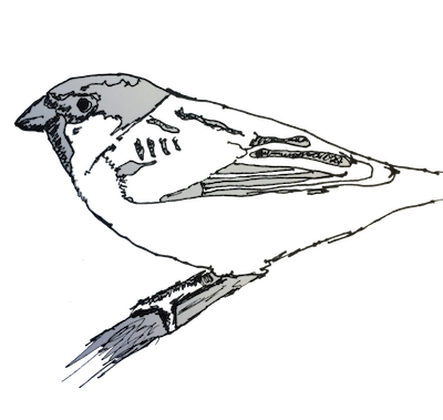
The book was a 1966 copy of Birds of North America . I must of borrowed, bought, or stolen it at some point in life, only to forget of its existence.
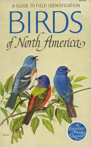
Get yourself a copy, if you get the chance. Even Tufte agrees : its good. (In fact, I have started casually collecting as many Golden Guide and Golden Field Guide books as I can find. They are all amazing.)
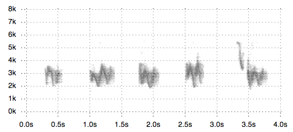
Laced throughout the pages of this great resource, I discovered an interesting visual approach to depicting bird calls and songs on paper. Labelled a “sonagram” in the book, this method is now known as a spectrogram (probably to reduce confusion with modern day baby detecting and depicting technologies).
You can see them below, right above the range maps for each species.
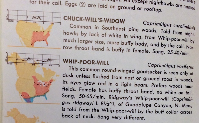
From the notes in the front of the book, this is the first time this type of visual representation was used on the general public. And I think it works pretty darn well.
Its not a complex format. Really, a sort of specialized scatter plot. Time is on the x axis, frequency on the y. As you might guess, low notes have lower frequencies and high notes have higher frequencies. Cells within the graph are shaded by the intensity or loudness of a particular frequency at a particular time.
This simplistic framework allows for the complexity of natural sounds to be revealed.
Sounds from bird calls to cat calls show patterns that span the spectrum. Once you are able to pair a sound with its spectrogram, you can start hearing all the little complexities that are present in the visual. Furthermore, you can develop an intuition about what something will sound like - just from the spectrogram itself.
Of course, when I saw how beautiful this visualization was, I wanted to create some of my own. So I made a little tool to do just that!
Its called SpectrogramJS and you can try it out here and use it in your own projects!
Click analyze to begin processing the provided sound. Once done, you can hit play again to follow along with the spectrogram as the sound plays.
Simple, but I think pretty true to the original - while being more useful then a static image.
Check out the SpectrogramJS github to start visualizing your own bird calls today.
More on how SpectrogramJS was built below.
Reinventing the Wheel
It turns out others before me have heard the spectrogram’s siren call, and have developed software to generate similar charts. Audacity appears to have a spectrogram view . In fact, the Raven product suite, which includes the free Raven Lite, looks to be a powerful tool specifically for the purposes of analyzing bird songs and other animal calls using spectrograms.
Ok, so the spectrogram ground is pretty well covered. Implementing my own version wouldn’t necessarily be practical - or even useful - in light of these other much more robust systems. Or at least, these were my initial thoughts.
However, these tools are heavyweights in their field. And with all that power and bulk can be limiting in their own way.
What about a lightweight tool for quick and dirty spectrogram creations? One that could provide interactive capabilities outside of traditional applications and instead provide a web-based experience.
HTML5 Web Audio API to the Rescue!
So, I turned to the still developing Web Audio API to see if such a web-based experience could be had. It turns out that this API has audio analysis capabilities that make it suited for all sorts of audio visualizations.
In fact, cool spectrogram projects have already been implemented using this API. Google created a 3d sonogram to demo the use of the Web Audio API. Jos Dirksen also has a great moving spectrogram as part of his tutorial on web audio.
So, for my project, I focus on just replicating the look and feel of my original inspiration - the bird book. Clean and simple, providing insight and context.
I am just dipping my toes in the Audio API stream right now, but most of my knowledge comes from the wonderful Web Audio API book by Boris Smus (which is currently free to read on O’Reilly). Some of this content is also in the tutorials on HTML5 Rocks - which is also a great starting point.
From what I understand, the Web Audio API is used by creating and connecting nodes together in a directed graph, called the audio context . These nodes can be audio sources, audio outputs, or nodes to analyze and manipulate.
It is these analyzing nodes that we take advantage of to allow for the analysis of the temporal and frequency aspects of a sound. My audio context looks pretty simple for this visualization:
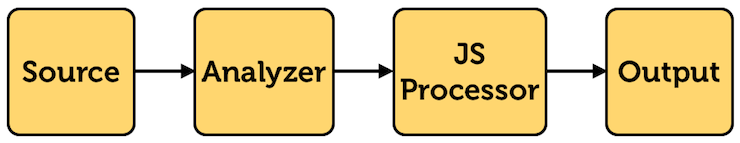
Specifically, createAnalyser() will create an instance of a Web Audio Analyzer that can provide frequency data through a Fourier transform . Its getByteFrequencyData() function dumps an array of frequency values for the portion of the audio stream currently being analyzed.
To sample frequency data throughout the sound clip, createScriptProcessor() is used to create a JavaScript processing node that will execute a callback at a particular sample rate.
The sampling callback is pretty simple. After some setup, it really just appends frequency data to an array of hashes - one for each sample point:
this.count += 1;
this.curTime = (this.sampleRate * this.count) / this.buffer.sampleRate;
this.analyser.getByteFrequencyData(this.freqs);

var d = { key: this.curTime, values: new Uint8Array(this.freqs) };
this.data.push(d);
Once the entire audio input has been analyzed, this data array forms the basis of the visualization. D3 is used to display this data. Due to the density of the dataset, I opted to use canvas to handle the main display, with SVG used for the axes and other visuals.
So, if nothing else, this visualization might be a good example of combining SVG and canvas for a nice one-two punch!
The visualization code is pretty simple. After some cleanup, the data array is drawn in the canvas using a loop:
Spectrogram.prototype.draw = function() {
  // ...

  this.svg.select(".x.axis").call(this.xAxis);
  this.svg.select(".y.axis").call(this.yAxis);

  var visContext = d3
    .select(this.selector)
    .select(".vis_canvas")[0][0]
    .getContext("2d");

  // clear canvas to prepare for new draw
  visContext.clearRect(0, 0, this.width + this.margin.left, this.height);

  this.data.forEach(function(d) {
    for (var i = 0; i < d.values.length - 1; i++) {
      var v = d.values[i];
      var x = that.xScale(d.key);
      var y = that.yScale(that.getBinFrequency(i));

      // draw to canvas
      visContext.fillStyle = that.zScale(v);
      visContext.fillRect(x, y, that.dotWidth, that.dotHeight);
    }
  });
};
As shown in the previous code snippet, d.key is the time point being sampled. d.values is the actual frequency data. Each value in d.values, v is plotted on the graph - its numerical value dictating its fill color.
For a 4 second audio clip (with a sample rate of 44.1 kHz), processing each 512 frames, you get around 358,000 data points to visualize. You can bump the processing down to every 256 frames to get 716,800 if you want - but things get a bit lethargic when updating the visualization. Still, that’s a lot of points to look at!
Future Work
Right now SpectrogramJS is a bit of a proof of concept. A lot more could go into making it more interactive, add features, and clean up the horrendous code.
If you think you might want to try using SpectrogramJS out - and have suggestions or need improvements, let me know!
So get out there and start visualizing sounds in your browser today!