Using d3 and force-directed maps to see the impact of segregation in cities
I wanted to create a visualization to highlight the impact of the deep segregation that still exists in many US cities today. I think the Choropleth maps like those in Salon’s most segregated urban areas slide-show are great in terms of showing the reality of this problem. I wanted to come up with a more visual and perhaps more visceral way to show these racial divides and how they serve as real boundaries in and around communities.
Force-Directed Maps
Originally, I thought about using elevation to show these breaks, similar to these topographical crime rate maps . This still might be interesting to experiment with, but I decided to try to stick to a 2D method.
Force-directed maps is a name you could give to a force-directed graph made up of neighboring components of a map. Mike Bostock has demonstrated them a few times using a map of the United States: both in his Trulia Talk and his SVG Open Keynote . Here’s his example:
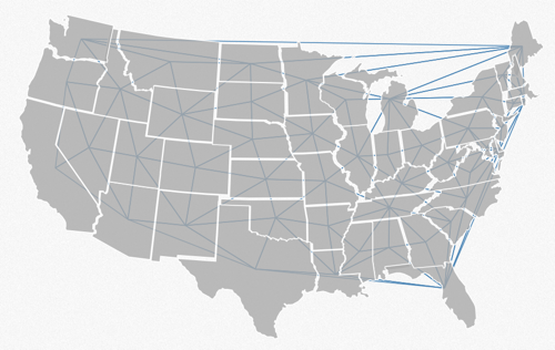
I decided to use this concept to show how segregation in a city can ‘break it apart’. Here’s an example from Kansas City:
See animated visualizations for a number of cities here
The visualization uses d3.js and works best with Google Chrome.
Cities were picked from the list of most segregated cities, ordered from most to least.
About the Visualization
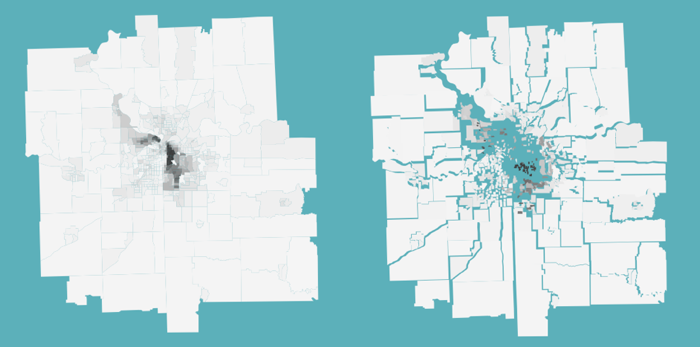
Data is from the 2010 Census, at the tract level. The links are hidden, but each tract is connected to each of its neighbors. The lengths of these connections encode the disparity between racial make-up between neighboring tracts. So, if a ‘mostly white’ tract is connected to another ‘mostly white’ tract, then the connection is short. If a city had uniform proportions of races in each tract, the map would not move much. However, longer connections occur where there is a sharp change in the proportions of white and black populations between neighboring tracts. These longer connections create rifts in the map and force areas apart, in some ways mimicking the real-world effects of these racial lines.
I’d love to hear your thoughts on these visualization style. Certainly it is not really meant to provide exact numbers. These maps only encode differences between white and black populations. It would be interesting to include other racial divides as well. The line length encoding also has some issues when there are few neighbors around with short connections. This can be seen in the smaller towns such as Wichita. Large cities like Chicago have too many tracts to keep the animation smooth.