
This post is very old and no longer represents the current state of how to use D3 properly. You should check out my updated Creating Bubble Charts with D3v4 instead!
Update: I moved the code to its own github repo - to make it easier to consume and maintain.
Update #2 I’ve rewritten this tutorial in straight JavaScript. So if you aren’t that in to CoffeeScript, check the new one out!
Recently, the New York Times featured a bubble chart of the proposed budget for 2013 by Shan Carter . It features some nice, organic, animations, and smooth transitions that add a lot of visual appeal to the graphic. This was all done using D3.js .
As FlowingData commenters point out , the use of bubbles may or may not be the best way to display this dataset. Still, the way this visualization draws you in and gets you to interact makes it a nice piece and one that makes you wonder how they did it.
In this post, we attempt to tease out some of the details of how this graphic works.
Simple Animated Bubble Chart
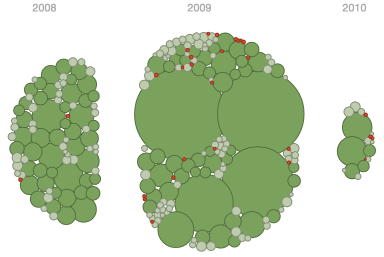
In order to better understand the budget visualization, I’ve created a similar bubble chart that displays information about what education-based donations the Gates Foundation has made.
You can see the full visualization here
And the visualization code is on github
The bubbles are color coded based on grant amount (I know the double encoding using size and color isn’t very helpful - but this data set didn’t have any quick and easy categorical fields besides year).
The data for this visualization comes from the Washington Posts DataPost . I’ve added a categorization to the amount for each grant (low, medium, high) and pulled out the start year, but otherwise have left the data alone.
The rest of this tutorial will walk through the functionality behind this Gates Foundation visualization. This visualization is just a sketch of the functionality in the New York Times graphic - so we can see the relevant parts clearly.
D3’s Force Layout
The Force Layout component of D3.js is used to great effect to provide most of the functionality behind the transitions, animations, and collisions in the visualization.
This layout essentially starts up a little physics simulation in your visualization. Components push and pull at one another, eventually settling in to their final positions. Typically, this layout is used for graph visualization . Here, however, we forgo the use of edges and instead use it just to move around the nodes of a graph.
This means we don’t really need to know much about graph theory to understand how this graphic works. However, we do need to know the components that make up a force layout, and how to use them.
Force Layout Quick Reference
Here are some of the concepts this visualization will use.
nodes
nodes is an array of objects that will be used as the nodes (i.e. bubbles in this graph) in the layout. Each node in the array needs a few attributes like x and y.
In this visualization, we set some of the required attributes manually - so we are in full control of them. The rest we let D3 set and handle internally.
gravity
In D3’s force layout, gravity isn’t really a force pushing downwards. Rather, it is a force that can push nodes towards the center of the layout.
The closer to the center a node is, the less of an impact the gravity parameter has on it.
Setting gravity to 0 disables it. gravity can also be negative. This gives the nodes a push away from the center.
friction
As the documentation states , perhaps a more accurate term for this force attribute would be velocity decay.
At each step of the physics simulation (or tick as it is called in D3), node movement is scaled by this friction. The recommended range of friction is 0 to 1, with 0 being no movement and 1 being no friction.
charge
The charge in a force layout refers to how nodes in the environment push away from one another or attract one another. Kind of like magnets, nodes have a charge that can be positive (attraction force) or negative (repelling force).
alpha
The alpha is the layout is described as the simulation’s cooling factor . I don’t know if that makes sense to me or not.
What I do know is that alpha starts at 0.1. After a few hundred ticks, alpha is decreased some amount. This continues until alpha is really small (for example 0.005), and then the simulation ends.
What this means is that alpha can be used to scale the movement of nodes in the simulation. So at the start, nodes will move relatively quickly. When the simulation is almost over, the nodes will just barely be tweaking their positions.
This allows you to damper the effects of the forces in your visualization over time. Without taking alpha into account, things like gravity would exert a consistent force on your nodes and pull them all into a clump.
How This Bubble Chart Works
Ok, we didn’t cover everything in the force layout, but we got through all the relevant bits for this visualization. Let me know if I messed anything up.
Now on to the interesting part!
There are two features of this bubble chart I want to talk about in more detail: collision detection and transitions.
Bubble Collision Detection
When I first saw the NYT chart, I was intrigued by how they could use different sized bubbles but not have them overlap or sit on top of one another.
The charge of a force layout specifies node-node repulsions, so it could be used to push nodes away from one another, creating this effect. But how can this work with different sizes if charge is just a single parameter?
The trick is that along with a static value, charge can also take a function, which is evaluated for each node in the layout, passing in that node’s data. Here is the charge function for this visualization:
charge: (d) ->
-Math.pow(d.radius, 2.0) / 8
Pretty simple right? But, for me at least, it was unclear from the charge documentation , that this function based approach was possible.
Lets break it down. Again this is coffeescript, so what we are seeing is a method called charge in my BubbleChart class. This method takes in an input parameter, d, which is the data associated with a node. The method returns the negative of the diameter of the node, divided by 8.
The negative is for pushing away nodes. Dividing by 8 scales the repulsion to an appropriate scale for the size of the visualization.
A couple of other factors are at work that also contribute to the nice looking placement of these nodes.
Here is the code that is used to configure and startup the force directed simulation:
display_group_all: () =>
@force.gravity(-0.01)
.charge(this.charge)
.friction(0.9)
.on "tick", (e) =>
@circles.each(this.move_towards_center(e.alpha))
.attr("cx", (d) -> d.x)
.attr("cy", (d) -> d.y)

@force.start()
So @force is an instance variable of BubbleChart holding the force layout for the visualization. You can see the use of the charge method for the layout’s charge input. We set its gravity to -0.01 and its friction value to 0.9 (which is the default). This says that nodes should be ever so slightly pushed away from the center of the layout, but there should be just enough friction to prevent them from scattering away.
We will get to the tick function in the next section.
So, nodes push away from one another based on their diameter - providing nice looking collision detection. The gravity and friction settings work along with this pushing to ensure nodes are sucked together or pushed away too far. Its a nice combo.
Animation and Transitions
The original graphic has some nice transitions between views of the data, where bubbles are pulled apart into separate groups. I’ve replicated this somewhat by having a view that divides up Gate’s grants by year.
How is this done? Well, lets start with the all-together view first. The position of each node is determined by the function called for each tick of the simulation. This function gets passed in the tick event, which includes the alpha for this iteration of the simulation.
We can see this function in the code segment above. I’ll highlight it again here:
# ...

.on "tick", (e) =>
@circles.each(this.move_towards_center(e.alpha))
.attr("cx", (d) -> d.x)
.attr("cy", (d) -> d.y)
The @circles instance variable holds the svg circles that represent each node. So what this code does is for every tick event, for each circle in @circles, the move_towards_center method is called, with the current alpha value passed in. Then, The cx and cy of each circle is set based on it’s data’s x and y values.
So, move_towards_center must be doing something with the data’s x and y values to get things to move. And indeed it is:
move*towards_center: (alpha) =>
(d) =>
d.x = d.x + (@center.x - d.x) * (@damper + 0.02) _ alpha
d.y = d.y + (@center.y - d.y) _ (@damper + 0.02) \_ alpha
So move_towards_center returns a function that is called for each circle, passing in its data. Inside this function, the x and y values of the data are pushed towards the @center point (which is set to the center of the visualization). This push towards the center is dampened by a constant, 0.02 + @damper and alpha.
The alpha dampening allows the push towards the center to be reduced over the course of the simulation, giving other forces like gravity and charge the opportunity to push back.
The variable @damper is set to 0.1. This probably took some time to find a good value for.
Ok, we’ve now seen how the nodes in the simulation move towards one point, what about multiple locations? The code is just about the same:
display_by_year: () =>
@force.gravity(@layout_gravity)
.charge(this.charge)
.friction(0.9)
.on "tick", (e) =>
@circles.each(this.move_towards_year(e.alpha))
.attr("cx", (d) -> d.x)
.attr("cy", (d) -> d.y)
@force.start()

move*towards_year: (alpha) =>
(d) =>
target = @year_centers[d.year]
d.x = d.x + (target.x - d.x) * (@damper + 0.02) _ alpha _ 1.1
d.y = d.y + (target.y - d.y) _ (@damper + 0.02) _ alpha \_ 1.1
The switch to displaying by year is done by restarting the force simulation. This time the tick function calls move_towards_year. Otherwise it’s about the same as display_group_all.
move_towards_year is almost the same as move_towards_center. The difference being that first the correct year point is extracted from @year_centers. Here’s what that variable looks like:
@year_centers = {
"2008": {x: @width / 3, y: @height / 2},
"2009": {x: @width / 2, y: @height / 2},
"2010": {x: 2 \* @width / 3, y: @height / 2}
}
You can see this is just an associative array where each year has its own location to move towards.
move_towards_year also multiplies by 1.1 to speed up the transition a bit. Again, these numbers take some tweaking and experimentation to find. The code could be simplified a bit if you wanted to pass in the unique multipliers for each transition.
So we’ve seen a general pattern for both of these views: setup the tick method to iterate over all the nodes to change their locations. This was done using the each method.
In fact you can chain multiple each methods that call different move functions. This would allow you to push and pull your nodes in various ways depending on their features. The NYT graphic uses at least two move functions for these transitions. One to move nodes towards a group point (like above), and one to move nodes towards their respective color band.
Hope this tutorial shows you some interesting ways to use D3’s force layout. I thought the original NYT visualization was interesting enough to find out more about it. Again, the full visualization code can be found on github. It is just over 200 lines of code - including comments.
Force layouts: they are not just for force-directed graphs anymore!