Ages and ages ago as part of the Bocoup Data Visualization Team, I was fortunate to work on a project with Irene Ros and Peter Beshai where we were asked to prototype some experiments around visualizing uncertainty.
As the idea and importance of displaying uncertainty is not going away any time soon, I wanted to document my small contributions to this area with the hopes that it could spark inspiration for future (uncertain) work down the road.
Axis of Uncertainty
For any topic, it can be useful to define a loose taxonomy around it - to facilitate the exploration of its ‘space’. The space won’t be perfect, but it helps expand from existing work to possible future work (plus it makes you seem more of an expert!).
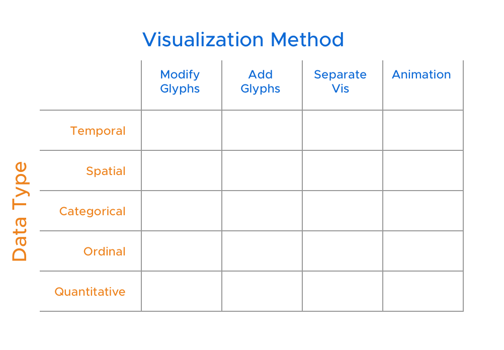
For uncertainty visualization, we started conjuring a space along two axes: the possible methods that could be used to visualize the uncertainty, and the data type of the “uncertain” data we are trying to visualize.
Visualization Methods
Now, visualization possibilities are what I typically think of first when I think about visualizing uncertainty. Nathan Yau has a great post on visualizing uncertainty where he outlines a number of different options, all of which (in my opinion) deal directly with encoding choices.
If I were to rename his headers a bit, the possible options I see him suggesting include:
- Modification of glyphs (Obscurity)
- Additional glyphs (error bars and other overlays)
- Standalone visualizations (e.g. showing distributions)
- Animation (Simulation)
These categories are a bit generic, and are probably not comprehensive, but provide one way to slice up the uncertainty visualization space.
Data Types
The other dimension we might split on is around different types of data that exist and thus can have uncertainty associated with them. Here I’m talking about statistical data types as opposed to data types of a particular programming language. Briefly, the main data types I like to think about are:
- Categorical (sometimes called nominal)
- Ordinal (where the values are discrete, but order matters)
- Quantitative (aka continuous or real-valued)
To this basic list, we can add a few more types that I believe warrant separating:
- Temporal (dates, hours, minutes - time is special!)
- Spatial (or geographical, e.g. lat & lon values)
An Uncertain Taxonomy
With the possible values set for these two axes, we get a grid of possibilities to explore. And everyone knows that when there’s a grid, there’s a taxonomy! This table provides a tiny framework by which we can start to categorize existing uncertainty visualizations. It also provides a bit of inspiration for where one might explore to create novel uncertainty visuals.
This grid is super coarse in its capabilities to catalog. It’s my thought that each of the above “visualization methods” could be expanded further, either based on particular encoding options or perhaps by which visual metaphors are used, which would form a sort of taxonomy cube!
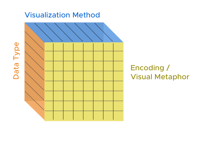
Our ultimate hope with our experimentation was to explore this entire cube, but for now I will just provide some examples from a tiny corner of the taxonomy.
(Also, I think there is a lot more to say about visual metaphors in data vis, but that is a topic for another time).
Uncertainty and Simulation
The area I really wanted to explore more was around how animation was used to visualize the notion of simulating possible outcomes from an uncertain future. As the reactions around the NYT Election Needle indicated, animation can be a very motivating when displaying uncertainty.
Fortunately, there is some prior work in this area. Jessica Hulman et al have developed HOP Plots which I see fitting very nicely in grid for using animation to visualize uncertainty around quantitative values. You can find a nice write up on the UW Interactive Data Lab Blog.
Here are some basic recreations of the HOP plot idea where I’ve added a stop/start button, but left out any scale or annotation.
A slow HOP plot:
A fast HOP plot:
As an exercise, we experimented with showing a history of simulations using onion skinning, which I deemed the “Onion HOP Plot”:
A slow Onion HOP plot:
A fast Onion HOP plot:
So, using this existing work as guidance, we started thinking about how animation could be used to display uncertainty for these other data types. I’m excited to start to fill in two additional little boxes in the grid for animation and categorical uncertainty and geographic uncertainty.
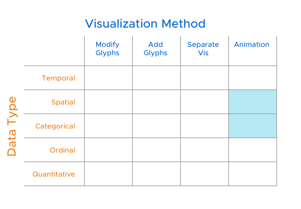
Morph Icons
Let’s start with the simpler of the two: using animation to visualize uncertainty around categorical data.
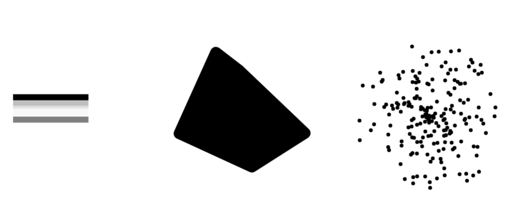
Consider some categorical data that can each be one of a few possible values. Say also that these possible values can be represented as icons. Here is our universe of possible iconic values:
The kicker is that for any particular data point, we aren’t 100% certain which value it should be classified as. And so for each data point we have probabilities associated with a subset of these categories.
The specifics of what this data is, is hopefully somewhat generic - and not all that important to the visualization method. Perhaps this is an automatic labelling of a set of images by a computer algorithm, or some other classification problem with a finite number of possible categories.
Our Morphing Icons idea is a pretty simple one: take those probabilities associated with each possible category and show each icon for a length of time based on that probability. So, if we are 90% certain an item is of type A and 10% it is of type B, then show type A’s icon 90% of the time, and type B’s 10%.
Here’s examples using 2 and 3 possible icons:
Morphing Icon with 2 types:
Morphing Icon with 3 types:
The morphing icon on the left is showing 50% A and 50% C probabilities. The one on the right is showing 70% A, 20% D, and 10% E.
Here are a few other examples, just for fun:
Of course there are all sorts of caveats and limitations to this approach to displaying categorical uncertainty. It breaks down if there are too many possible categorical values, or if there are no acceptable icon representations. It’s also unclear how long each loop of the animation should take.
Also, while this visual certainly uses animation, it is not really a simulation of the possible data. A real simulation would draw results based on the associated probabilities and thus flash back and forth between categories rapidly, based on which one was selected each iteration.
All that being said, I still enjoyed this representation. One could imagine a toggleable ‘detail’ view that showed the probabilities explicitly when needed.
Wandering Dots
The other prototype I wanted to show also uses animation to show uncertainty, but this time for spatial data.
Here we have a very similar problem. Say we have events that happen somewhere in a particular region of the world. We want to display them, but don’t know exactly where they happened. For whatever reason, we only know the location of each event at some resolution.
For example, the data might have a group of events as happening at a particular city, but another group we might only know the county or state they occured in. These resolution levels thus indicate the amount of uncertainty associated with each event location.
One of the approaches we experimented with tackling this type of uncertainty with animation was what we called Wandering Dots. The idea again, is nothing mind-blowing, and has plenty of drawbacks, but is still interesting (at least to me).
With Wandering Dots, each event is representing as a dot (genius!). Each dot is animated to indicate the resolution of the data. Dots wander far (have a larger radius) for events that we are more uncertain about.
Wandering Dots with a large radius:
Wandering Dots with a small radius:
The wandering is random within the constraints of their assigned radius. But they maintain a fluid trajectory, instead of hoping all over the place, to all the following of an individual event, if need be.
Wandering Dots with many points:
Wandering Dots with few points:
Wandering Hulls
Briefly, we also explored the idea of a using a solid plane to represent this uncertainty, called Wandering Hulls.
Wandering Hull with large radius:
Wandering Hull with small radius:
The idea was that we could perhaps use a choropleth approach with these hulls. However, the lack of access to individual points, as well as worries around occlusion, made us abandon this idea from further exploration.
Bounded Wandering Dots
Back with our dots, often times the level of resolution for an uncertain spatial data point corresponds with a particular geographic region - like a county or state.
Peter Beshai made a clever variant, the Bounded Wandering Dot which constrains the wandering to a specific shape.
Wandering Dots bounded by a square:
Wandering Dots bounded by a map region:
Pretty cool right?
An Uncomfortable Analysis
As part of our research, some of these prototypes were cleaned up and incorporated with other visuals into a dashboard-style tool for a small group of analysts to try out for a set of decision making activities.
Unfortunately we didn’t perform a controlled academic study around these representations, but we did get some initial impressions and feedback from these users.
One of the main pieces of feedback that has stuck with me is that the shifting visual representation made them feel a bit uncomfortable. But uncomfortable in a good way!
With more traditional uncertainty visualizations it can be easy to see the level of uncertainty, but ultimately ignore it, choosing the average over the error-bars, for example. While simpler aggregates are easy additions to these visuals, the animation provides perhaps a more visceral experience of the uncertainty that is harder to ignore.
Filling in the Cube
These quick examples are almost certainly not the “best” ways to represent uncertainty in these data types, but they are a start.
With more research in this area, I’m excited about the expansion and improvement to our informal taxonomy, as well as how other areas of the cube will be filled in with more ways to show the unknown. There are a lot of visual encodings and associated visual metaphors that can, and should be experimented with in this area. I’m looking forward to experimenting more in the future - and seeing how others tackle this uncertain issue!