WARNING: Lyra is labelled as alpha. Its interface might have changed since this posting.
A few days ago Arvind Satyanarayan from the UW Interactive Data Lab released an alpha version of Lyra that promises to be a way to create complex data visualizations without code. Think of it like an open source Adobe Illustrator, for data visualizations. Sounds pretty awesome, right? But does it work?!
Let’s find out.
There are a number of very interesting examples to learn from on the Lyra main page. These examples recreate some well known complex visuals.
I wanted to see what would be required to create a really basic bar chart - as a way to start to learn more about this interesting tool.
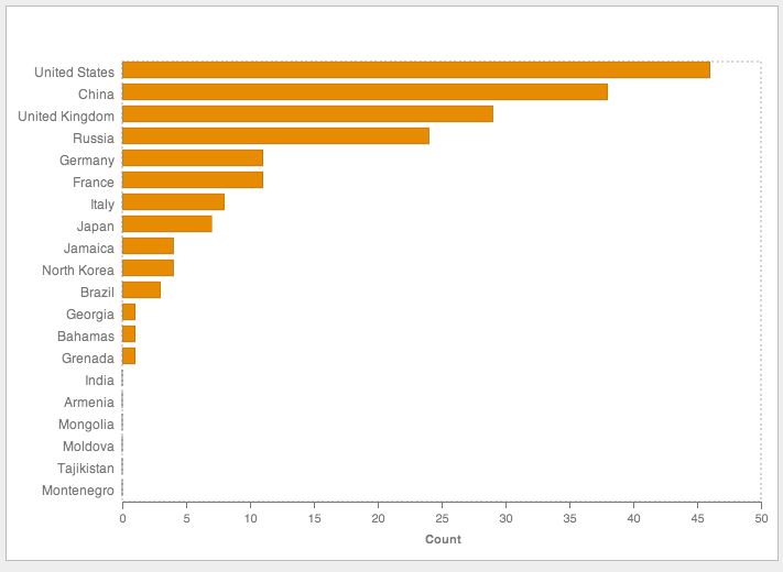
Here’s the final product:
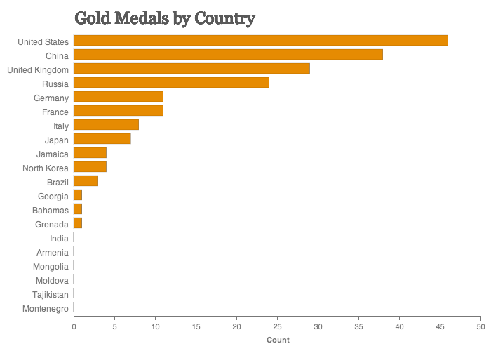
Pretty simple right? But sometimes simple ways are best . So follow along with me for a bit of Lyra fun!
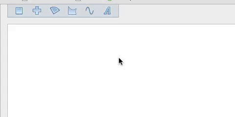
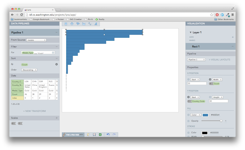
Your Visualization Development Environment
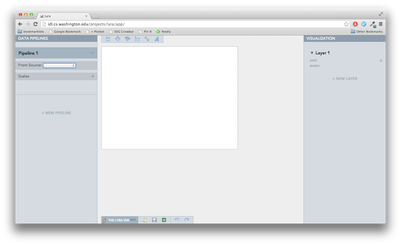
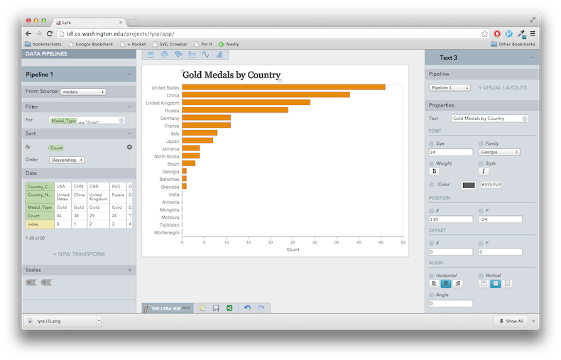
Here’s what it looks like when you first open Lyra :
I’ve annotated the app with my own terminology to provide a bit of orientation.
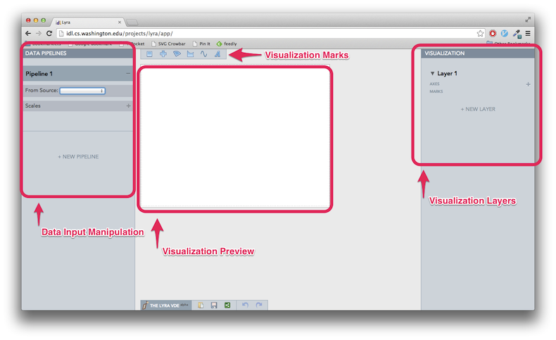
The far left panel provides capabilities to add data to the visualization and manipulate this data.
The top bar allows you to drag new visual components or marks into the visualization.
These marks are organized into layers (just like Illustrator!). Properties of the marks in a visualization can be manipulated in the far right panel. This panel is also used to modify the size of the visual, its axes, etc.
The middle gives you a preview of the visualization. You can also move around and resize the layers of your work here.
We will start with the data input and manipulation panel first. Far left.
A Simple Data Pipeline
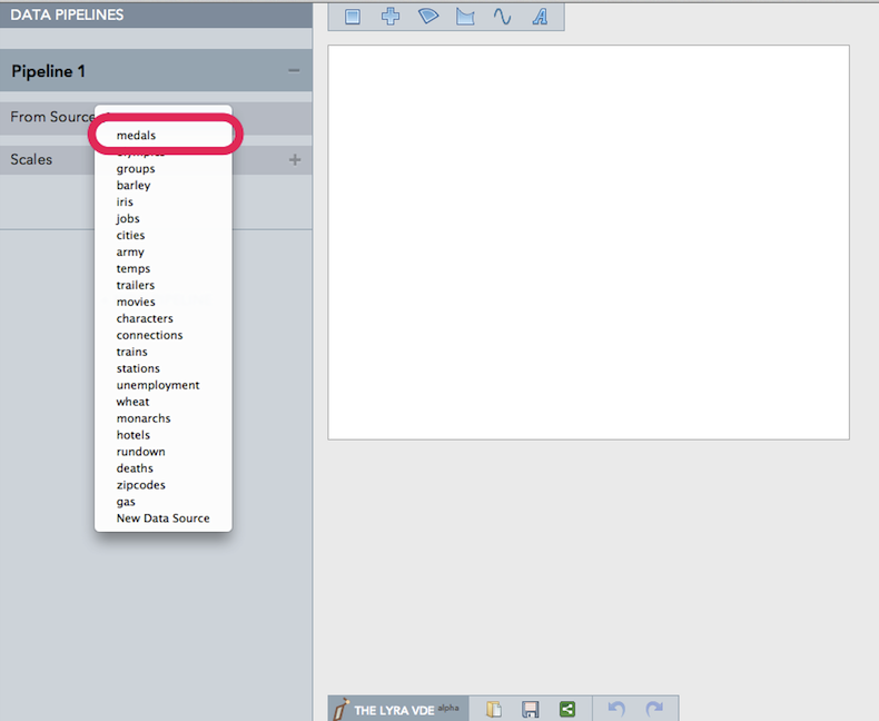
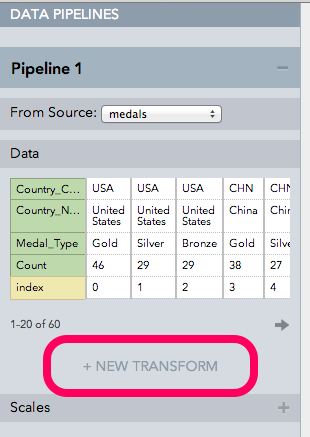
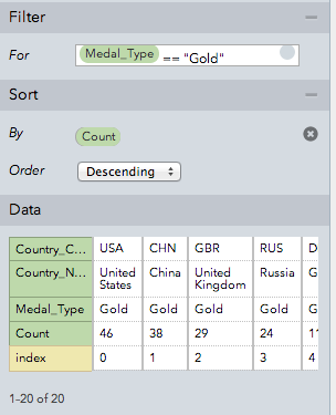
Let’s pull in some data. Adding and manipulating data in Lyra is called a Data Pipeline. To avoid complications, I used medals, one of the sample data sets provided by Lyra. This set gives data about who won what at the Olympics (I’m guessing it is the 2014 Winter Olympics, but I don’t really know. I don’t really know much Olympics).
Click on the From Source drop down and select medals.
The original data includes gold, silver, and bronze medal winnings. Let’s just go for gold!
Filter Transform
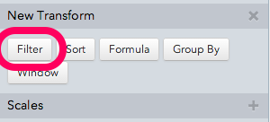
To get this done inside Lyra, we can use the Transforms feature to modify the input data.
Click on the New Transform button.
Then click on the Filter button
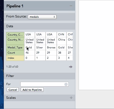
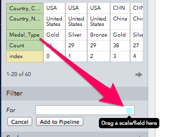
We get a little Filter input field. We are going to perform our first data binding in Lyra now. This involves dragging column names from the Data section to a little circle data binding visual.
In this instance we are going to drag the column Medal_Type over to the Filter section.
Here is a little animated gif of the whole process:
I’ll break it down step-by-step for the anti-gif folks out there. Here’s the Medal_Type move.
Once you do that, Medal_Type should show up in your filter input.
Now we are going to complete the filter by checking this column against the string “Gold”.
This appears to be JavaScript, so you are going to want to use the double equals: Medal_Type == "Gold". In fact, a single equals sign in that filter seems to modify your data on the fly… which could be useful in other circumstances.
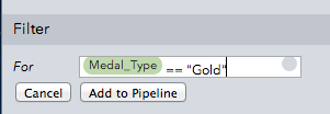
Once you have the filter setup, click Add to Pipeline. This will add the filter step to your pipeline (as you might guess by the name of the button).
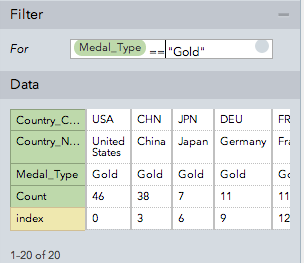
If you look at the values shown in the Data panel, you should see that only those with Medal_Type as Gold are shown. Pretty cool right?
Sort those Medals
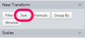
Now I want to sort the data in order of medal counts, so the countries with the most medals appear at the top. You might have guessed it by now, but we are going to use the sort Transform.
Click on the New Transform button again, but this time select Sort.
Now we need to pull Count down to the Sort By field:
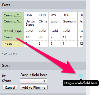
Then select Descending for the Order. Once you add this to the pipeline, we should have all our data transformations done, and be ready for some visualizing.
The Visualization
Now let’s move our attention over to the far right panel.
We see Visualization at the top, and Layer 1 which is clickable to show more options.
Give Yourself Some Room
One thing that took me a while to find was how to change the width and height of the entire visualization. The width and height of a layer (even the first layer) isn’t the same as the width and height of the entire visual.
To change the visualizations size, click on the Visualization header. You should see Dimensions and Padding options.
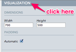
As you can see in the image above, I gave my visualization some space by changing the Width to 700 and Height to 500. I am assuming this is in pixels. For now, let’s leave the Padding setting alone.
Your First Mark
Now is the moment we’ve all been waiting for: the start of the actual visualization.
Visual elements, like rectangles, lines, and even text are known as marks. We are going to add a rectangle mark for our bar chart.
To do this, drag the rectangle mark from Marks Menu on top down to the visualization preview section:
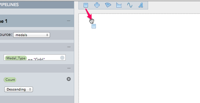
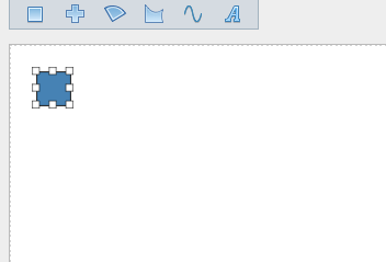
And release. You’ll be left with a little blue rectangle in your visualization preview.
Animated gif version:
The visualization panel should reflect this addition as well. You should see a Rect 1 mark under Layer 1. This is where we are going to associate data elements with the attributes of the rectangle.
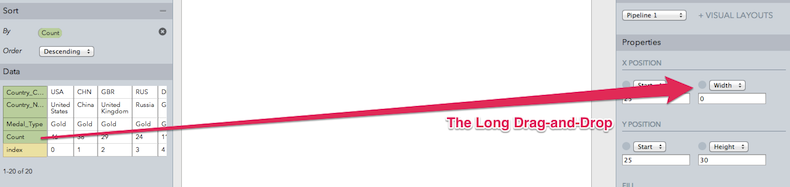
Binding the Data
Ok, so far this just looks like a drawing app. That square is nice and all, but isn’t what you would call a “data visualization”. Let’s really start making the vis happen by binding some data to the visual properties of the rectangle mark.
The process is similar to how we used data elements in our data transforms. It works by drag-and-drop.
Because we are making a vertical bar chart, I want to associate the width of one or more rectangles with the count of Olympic medals for a country. You should see Width listed as a property of Rect 1.
Right now it is set to a constant number. We are going to drag over the Count data element from our data pipeline and connect it to the little circle visual next to Width. You really have to drop it right on the circle to make it count.
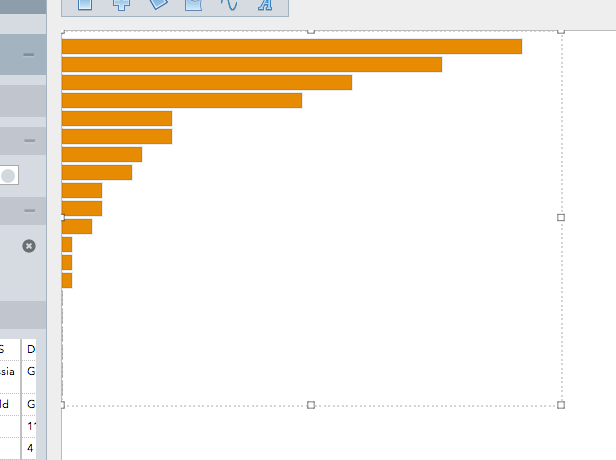
Once you release the data element, you should see your visualization preview change to show a bunch of rectangles on top of one another - instead of what looked like just one.
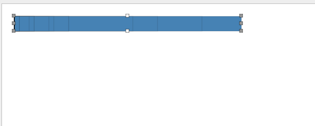
Not a bad start, but a bit crowded. Let’s move them off one another. I think you could do this a number of ways, but try binding the Country_Code data element to the mark’s Y Position property. Since the country code is unique for each bar (as we have already filtered to only include gold medals), this make each bar move to a unique position. Try it. Drag the Country_Code data element to Y Position and release.
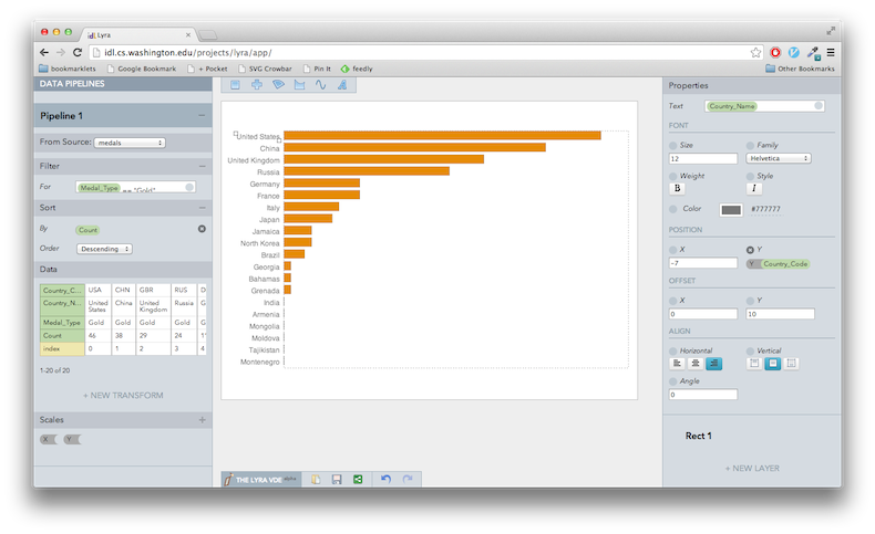
My Lyra looks something like this:
We can start to see a little bar chart starting to form. Exciting!
Getting the Look
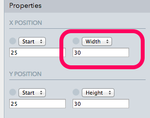
Now that we have bars, let’s make them a bit more attractive. First, modify the Height property to be 15 - so they aren’t sitting on top of one another.
Also, set the X Position to 0. We will move it around in a second.
Now we can gild our blue bars. Modify the Fill color property. You can type in a specific hex or other css color name. Feel free to pick one less terrible than mine. #e68b02 was as gold as I wanted to get.
Now I’m going to make room for my title and bar annotations by moving the layer over a bit. You could do this in the right panel by clicking on Layer 1 and setting the x/y position as well as the width and height. But, you can also do this in a more visual manner by moving the layer around in the Visualization Preview panel.
If you move your mouse inside the Visualization Preview, you should see the layer parameter highlighted with a little dotted line. Click inside that dotted line (but not on a bar) to select Layer 1. The little rectangles around the parameter should indicate it is selected.
Now click on these parameter rectangles and resize each side of the layer until its in the location you want. This will take some jostling - and can always be modified in the future.
You can check the settings in the Layer 1 properties. I ended up with the following:
- X Start :
105 - Width :
580 - Y Start :
50 - Height :
400
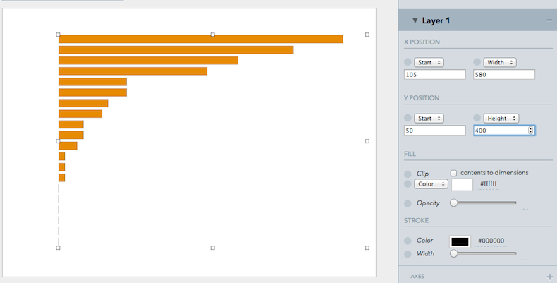
I don’t know if the visual manipulation is easier or more work than just trying out different values in the input boxes, but its nice to have options.
Again, the general idea is that I know I want to make room for a title and some labels on the side.
Label Those Bars
Ok, we make room for them, now let’s add some labels. As you might suspect, we are going to use the Text mark. Drag one of them down to your visualization preview - just like we did with the rectangle.
You should see a little blue text that reads “text”. Cute, but useless.
To get the country names on the screen, bind the Country_Name data element to the Text property of the text mark. This is the same drag-and-drop as before.
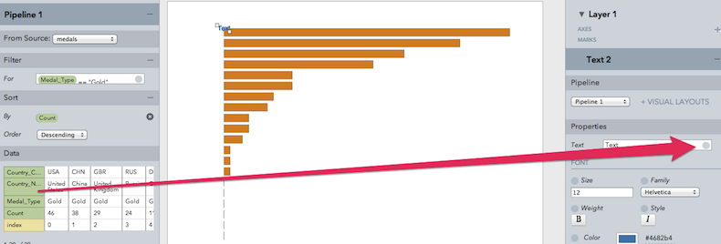
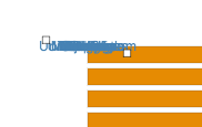
Now you have a big jumble of little blue text.
Bind the Y Position property to Country_Code, like you did for the rectangles. For some reason, I was having some problems with this drag-and-drop. Make sure the right circle changes color before you let go with your mouse.
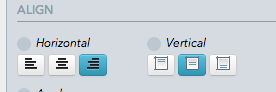
Now the labels are starting to look like labels. To clean them up a bit, I set their Align Horizontal to Right Align.
Next, I played around with the x/y position and offset. I ended up with a -7 X Position and a 10 Y Offset. Also, I changed the color to #777777. Ta Da!
Always Add an Axis
Things are coming along now!
But we need to give our visual some perspective. What numbers are these bars actually representing? 50? 500? Let’s add an axis to find out.
In Lyra, it looks like Axes are associated with a particular layer. If you scroll back to the top of the right panel, you should see a little Axes section with a plus button to add a new axis. Click that button now.
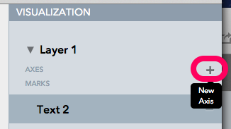
You should see a little new axis panel appear:
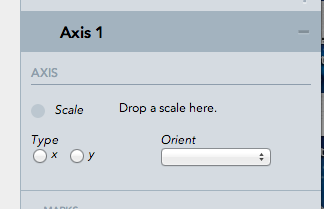
For Type we are going to use X. For orient, we are going to use bottom. Now we need to associate a Scale with the axis. In the bottom left-hand corner of the screen, you should see your Scales menu. Drag up your X Scale and drop it in the Axis Scale property.
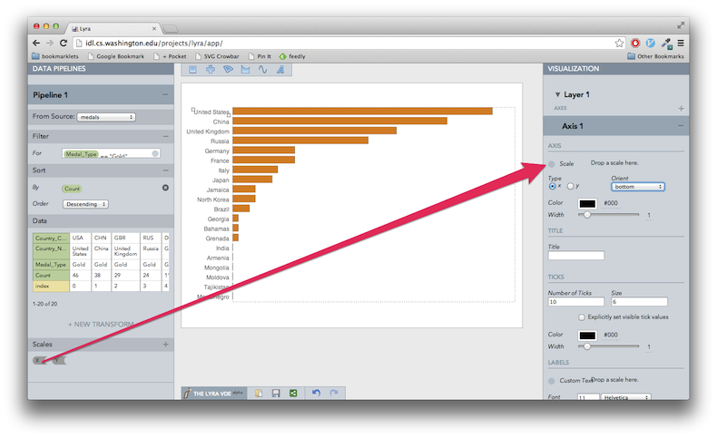
Once its dropped in, you should see your scale appear at the bottom of the preview panel. Pretty slick!
I changed all the colors of each element of the axis to #777777. I did try messing with the other properties of the axis mark and ended up screwing everything up. This will probably not be an issue in the future - but be advised - right now it seems a little picky.
Finish with a Title
Ok, my fingers are cramping up. We need to end this tutorial quick, so let’s add a title.
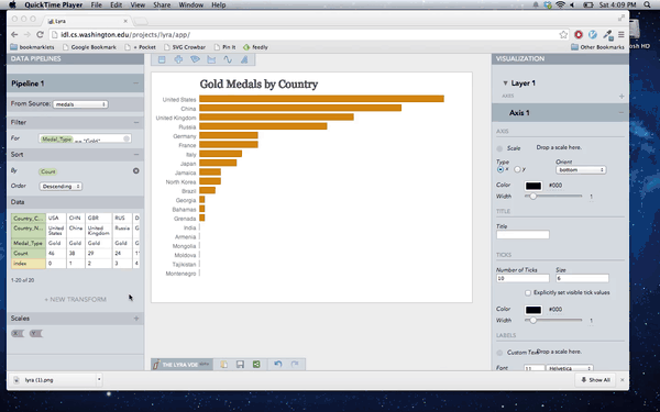
To do this, drop another Text mark into your visualization preview. Instead of associating its text with a data element, we will just type out a title. I choose “Gold Medals by Country”. You can use that too, if you want. A better title would be “Olympic Gold Medals by Country”. An even better title would include a date.
Next position and style. This should all be familiar, as we just did it with the labels. To mix things up a bit, I switched the Font Family to Georgia, and set the color to #595959. Font Size is 24.
Right now this text mark is part of the same layer as everything else. This might be the wrong way to do things - but it works at least in this simple example. A consequence of this association is that the Y Position will need to be negative to move the title above the chart. I set the Y Position as -24 and the X Position as 130 to get my particular styling. You can do better.
Save and Share!
Down at the bottom of the screen are a few utility buttons:
You can export your work of art as SVG or PNG for static showing. You can also export as a Vega spec to allow for more interactive end goals. I haven’t done much with Vega yet, but this is a particularly exciting possibility that will require future exploring.
You should also be able to save the Lyra settings in your browser history and load up old ones from this button bar.
Your Homework
Hopefully you enjoyed this little introduction to Lyra. I think it might turn out to be a very useful tool in the future for creating data visualizations in a systematic, but non-programmatic way.
If you want to build on this example, what about filtering out countries with 0 gold medals?
Right now India, Armenia, etc are shown, but their bar values are really 0. Try filtering out these countries and re-situating the visual elements to take up this extra space.
For the more adventurous, try getting a visual display for all 3 types of medals. This might involve using the Group By Transform to add some hierarchy to the data.
And that is a simple introduction to Lyra. Hopefully starting with the basics will encourage us all to start making more advanced graphics with these tools and allow us to better understand the more complex starting points created by the author.
My first thoughts on Lyra is that it is certainly rough around the edges, but could provide real value to the visualization community.
It has some overlap with Design Density’s wonderful RAW app. While RAW is more polished, I think Lyra might ultimately provide a more powerful feature set for those interested in learning the tool.
Lyra’s binding capabilities allow for comparisons to some of what is featured in Bret Victor’s Drawing Dynamic Visualizations tool. If his tool is released, it will be interesting to compare further.
D3’s success in the data visualization world has been in part because of its large thriving community . And this large community was built up quickly in part because of the many examples provided by the authors as well as other individuals.
Let’s hope Lyra, if it proves useful to others, is also able to foster an active community - capable of taking it to the next level.