There are many types of maps that are used to display data. Choropleths and Cartograms provide two great examples. I gave a talk, long long ago, about some of these map varieties.
Most of these more common map types focus on a particular variable that is displayed. But what if you have multiple variables that you would like to present on a map at the same time?
Here is my attempt to collect examples of multivariate maps I’ve found and organize them into a loose categorization. Follow along, or dive into the references, to spur on your own investigations and inspirations!
Before we begin, certainly you’ve heard by now that, even for geo-related data, a map is not always the right answer. With this collection, I am just trying to enumerate the various methods that have been attempted, without too much judgement as to whether it is a ‘good’ or ‘bad’ encoding. Ok? Ok!
3D
With the interactivity available to the modern map maker, it is not surprising that extending into the third dimension is a popular way to encode data.
Chicago Energy Map
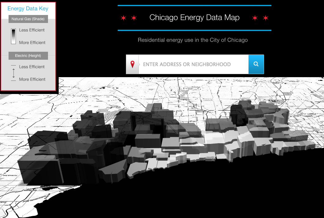
Source: Datascope Analysis Chicago Energy Data Map
The above uses color and 3D height to encode natural gas and electric efficiencies of various neighborhoods in Chicago. It doesn’t provide freeform rotation, but does allow you to rotate to different cardinal directions, which helps with the occlusion. This tool also provides a detailed census block view of the data after clicking a neighborhood.
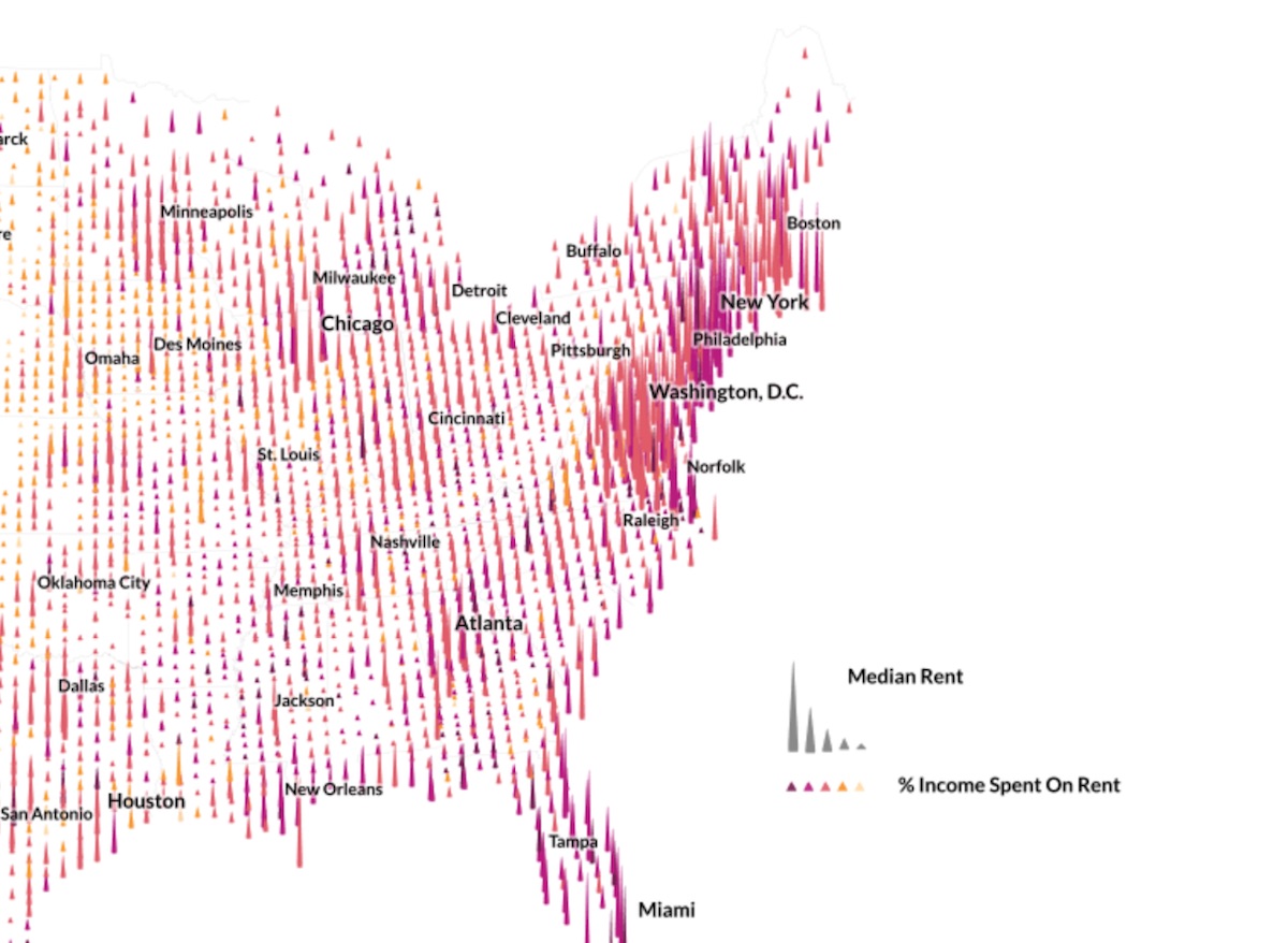
Median Household Income
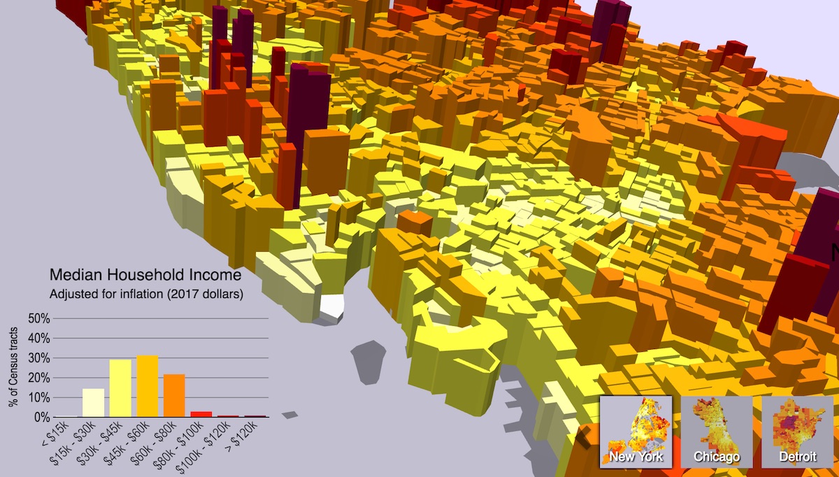
Source: Visualizing America’s Middle Class Squeeze
Created by Max Galka, this map duel encodes median household income for various cities using both color and tract height. This makes it not strictly multivariate, but it uses the same ideas.
Choropleth Hillshade
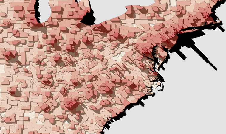
Source: Choropleth Hillshade
This tool is provided as an ArcGIS add-on for creating hillshaded versions of choropleth maps. I don’t use ArcGIS, but its interesting to see a generic tool to create these kinds of maps.
Topographical Crime Maps
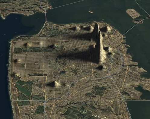
Source: Topographical Crime Maps
This was created by Doug McCune. It is not really multivariate, but I always really loved the style where he retains the basemap visual but uses hillshading to show geo-data in a very organic way. It seems like a technique that should have caught on more.
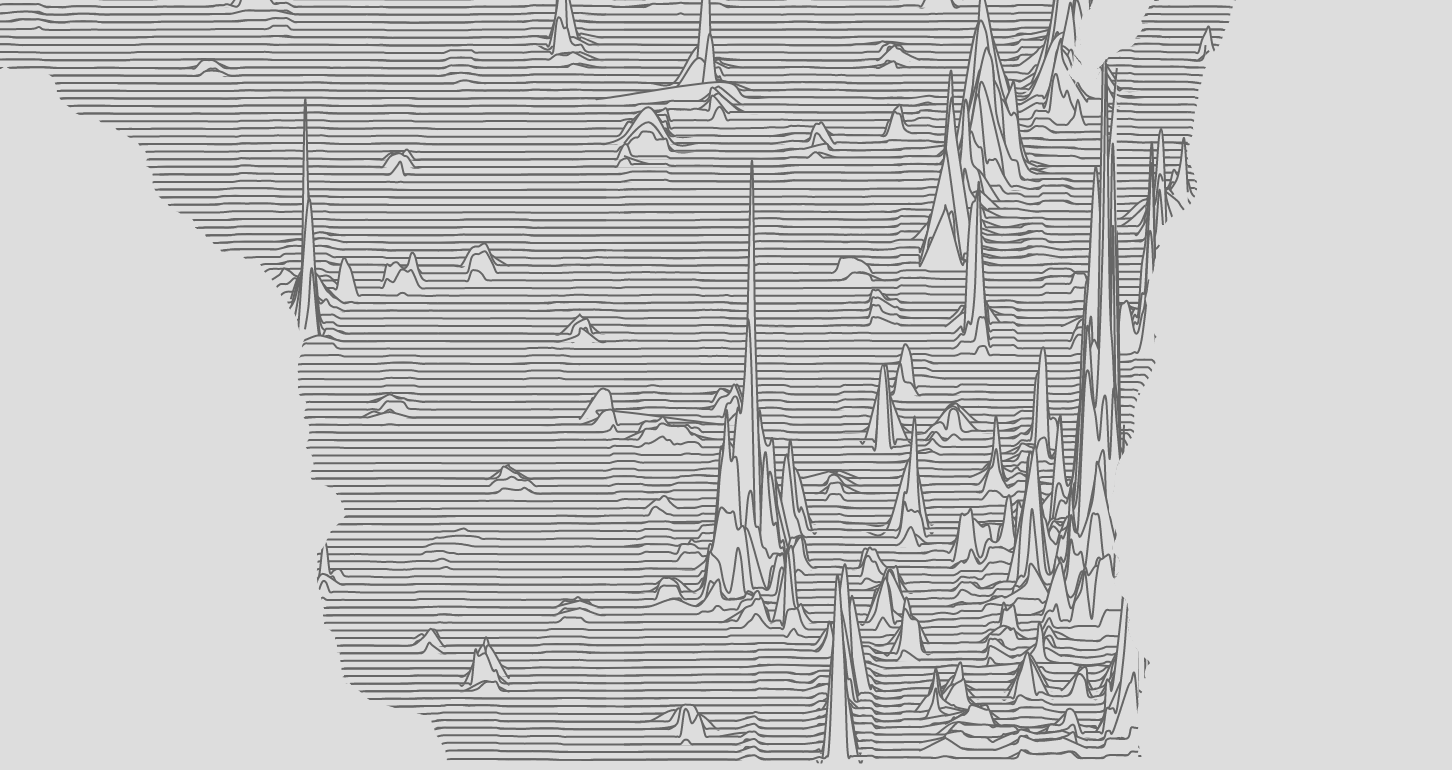
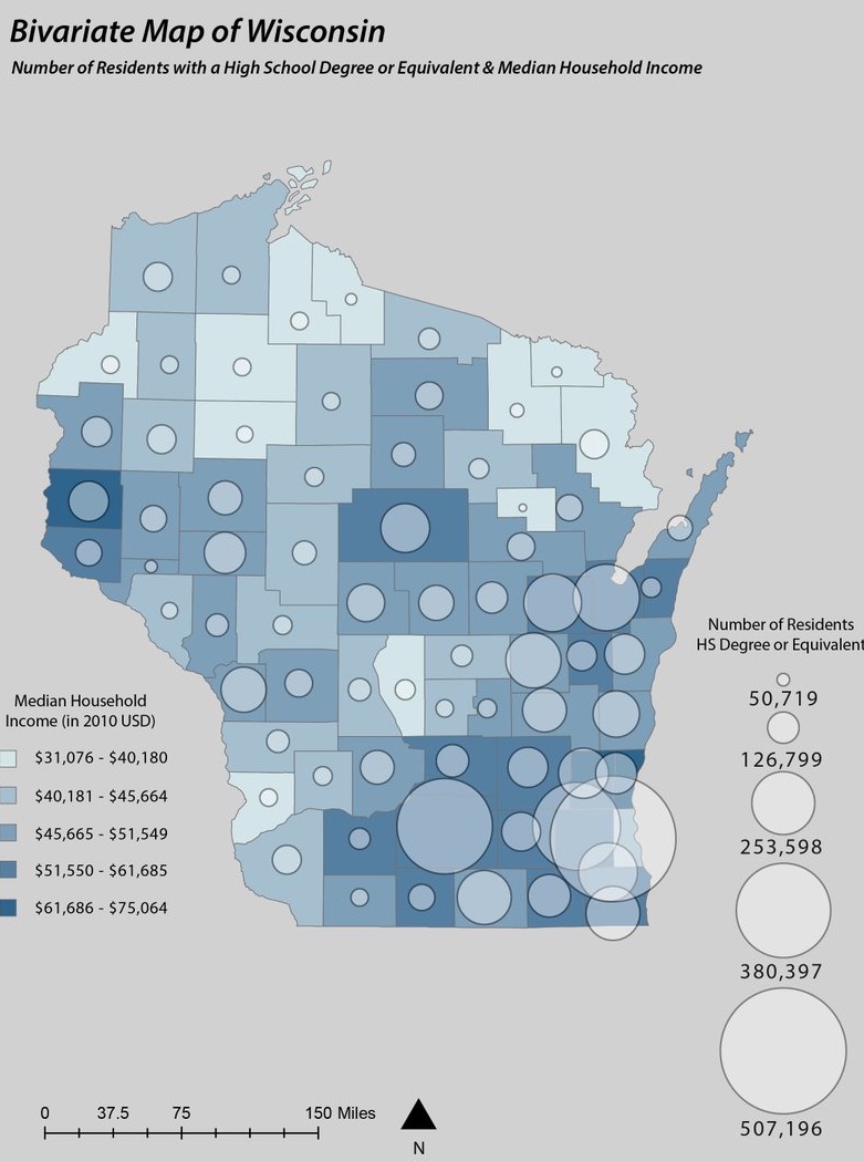
Data Mountains
Source: CartoDB
Taking the idea from exact shapes toward less precise icons are CartoDB’s Data Mountains. These maps use color and “mountain” size to encode multiple variables. The idea reminds me very much of geo-based Joyplots, like this great “Joymap” from Andrew Mollica showing the population density of Wisconsin:
Color
The idea of using color alone to represent multiple pieces of data may seem strange, but it can happen! Let’s take a look at a few examples
Bivariate Choropleth Maps

Source: Quartz: Where Medicaid Cuts Hit Hardest
This map of Trump voters vs Medicaid coverage is just one example of a somewhat popular technique. Joshua Stevens has a great article with everything you ever wanted to know about bivariate choropleths, so make sure you check that out.
Trivariate Choropleth Map
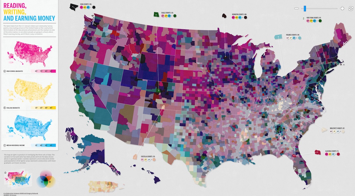
Source: Good: Reading, Writing, and Earning Money
If you thought two colors were hard, wait till you see three! This map generated a lot of musings back in 2011, so be sure to check out all the heat it garnered before trying to emulate it.
Trivariate Dot Map
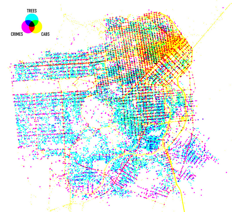
Source: Stamen: Trees, Cabs & Crime
Originally created in 2009 by Shawn Allen while he was at Stamen, this artistic piece no doubt influenced the trivariate choropleth we just looked at. With the city-level data in the dot map, you can see more interesting patterns (if you are familiar with San Francisco).
Small Multiples
If one of the variables you are visualizing is categorical in nature, it is possible to show a multitude of maps, one for each category. That is what we find in the map below.
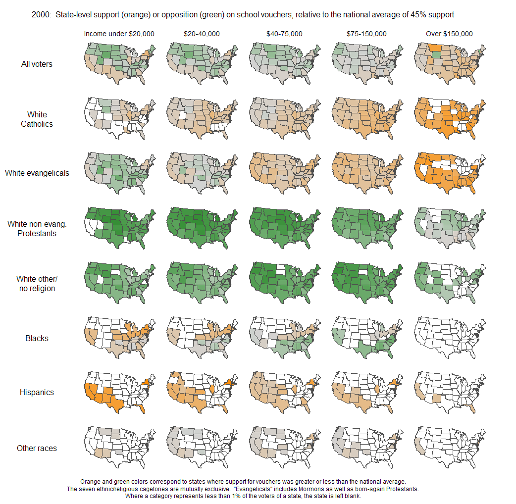
Source: Andrew Gelman: Estimates of support for School Vouchers
They also have a modified version with a different color scheme:
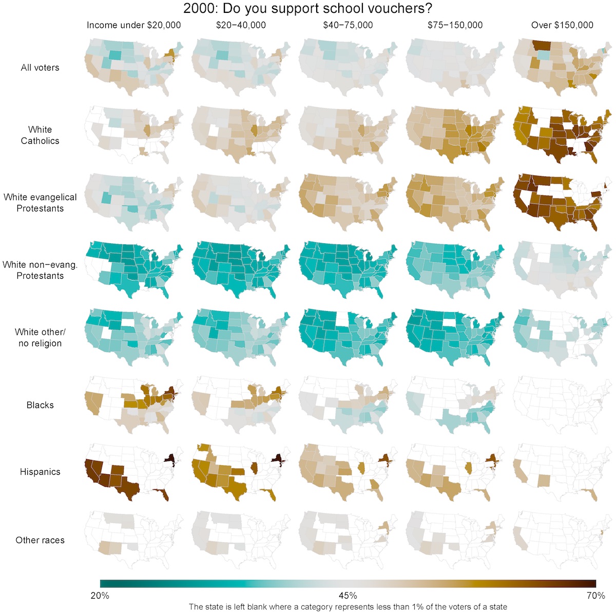
Source: Andrew Gelman
Embedded Charts and Symbols
Now we get to the interesting stuff! When you have multiple values to display specific locations on your map, why not layer in other chart types to display these values?
It seems in some ways obvious, but as we will see below, this just doesn’t always work out.
Circles
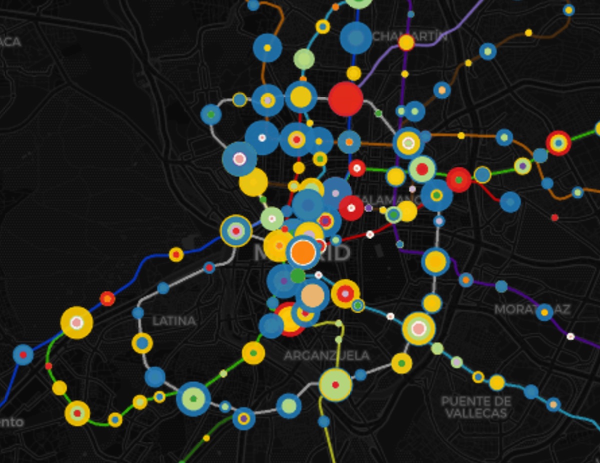
Source Carto: Madrid subway complaints by station
Source: Bill Scherkenbach
Pies
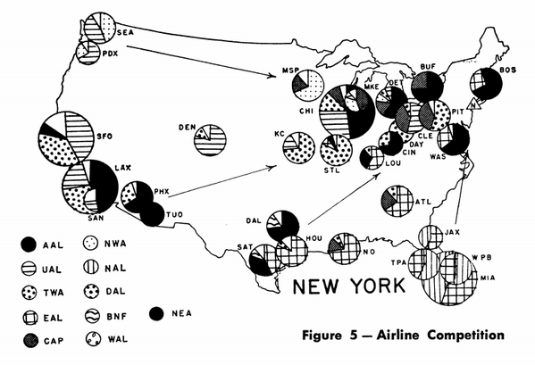
Source: A Map Analysis of US Airline Competition (found in a tweet from Tim Wallace)
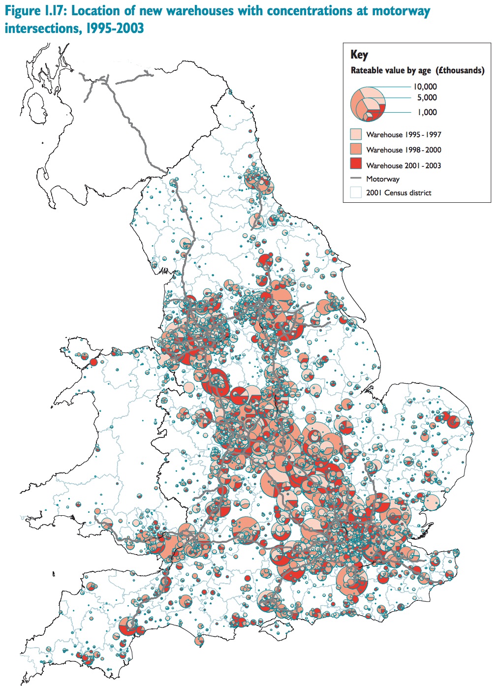
Source: The Eddington Transport Study (pdf)
Radars
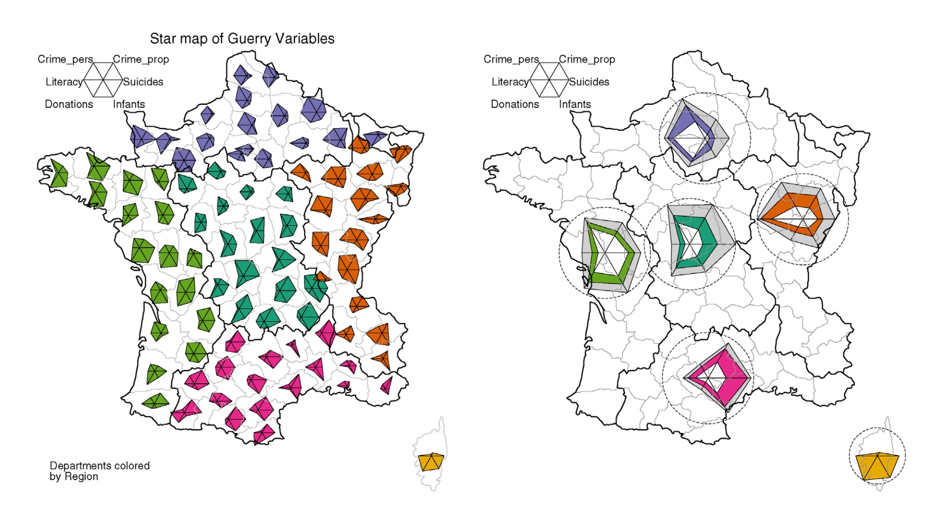
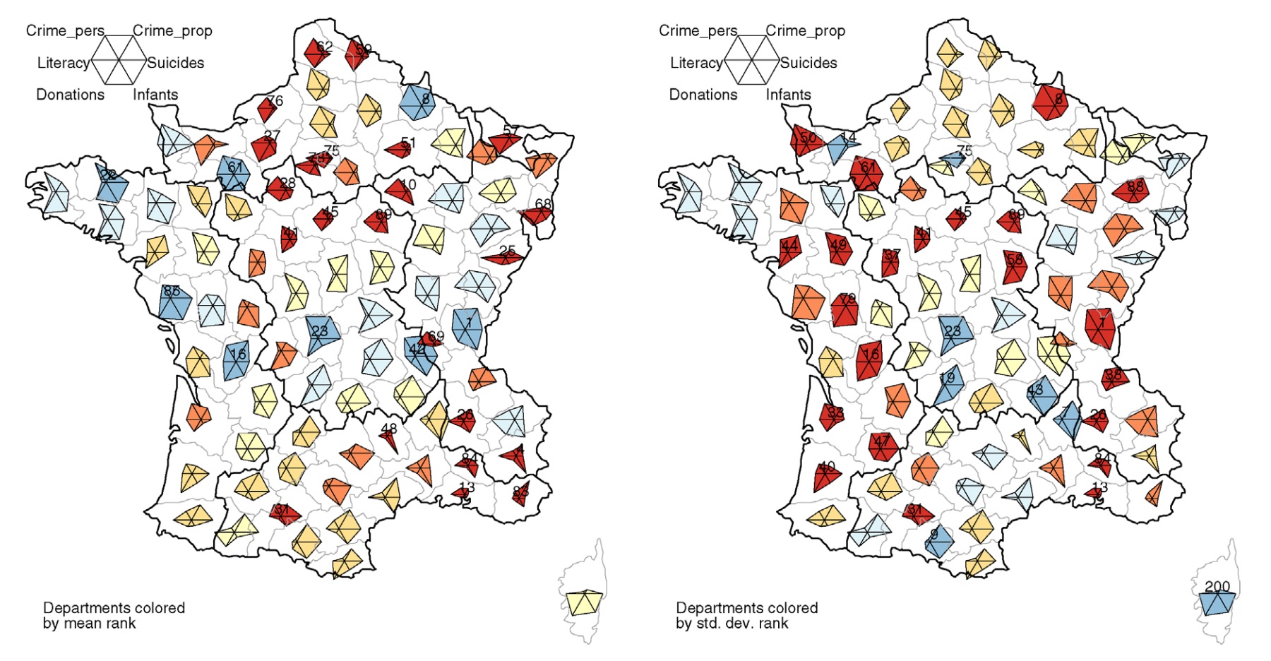
Source: Moral Statistics of France (pdf)
Lines
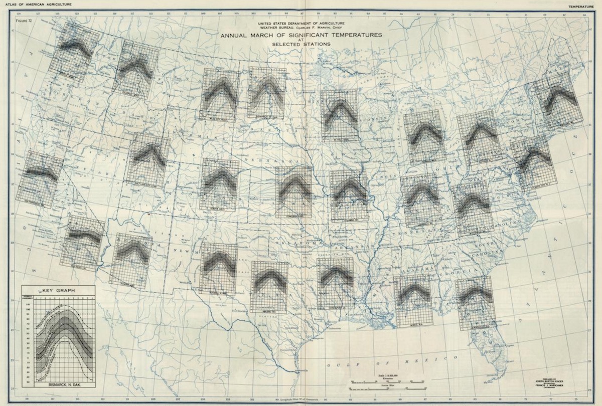
Source: Atlas of American Agriculture
Probably my favorite of the bunch, but that’s just cause I like old maps.
See Also
Hopefully this was a fun romp through the fun and strange possibilities of multivariate map displays. Come back to this page for potential inspiration or jumping off points the next time someone demands a map for your complex data.
Of course I’m not the only one who likes collecting, nor the first to ponder multivariate map encodings. For more, check out the great Axis Maps Thematic Cartography Guide which includes a multivariate section.
Have a technique I missed? Let me know!