Using d3 and coffeescript to reproduce old charts
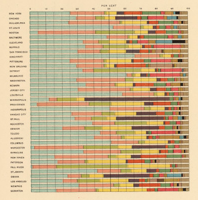
Recently, I stumbled upon a set of statistical charts from the 1800-1900’s in the David Rumsey Map Collection . While perhaps not the best forms of data visualization by today’s standards (pie charts, stacked bar charts, etc), they serve as beautiful inspirations visualization techniques due to their organization, attention to detail, color scheme, and presentation.
Here’s an example from the collection:
Based on the mantra’s of Enrico Bertini on Fell in Love with Data and perhaps also the guidelines of creativity from Everything is a Remix, I wanted to try to recreate (copy) a small selection of these charts using modern tools.
I choose to try out d3.js for this experiment. This is a javascript framework that is the official successor to the popular Protovis visualization toolkit. d3 allows you to represent your data with native SVG elements, which provides a lot of power in terms of layout and style. Furthermore, to make writing javascript more fun, I wrote the visualizations in coffeescript - a language that compiles down to javascript.
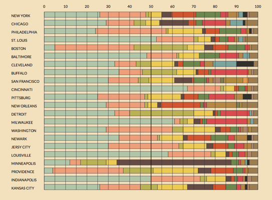
The process of recreating these graphs was a lot of fun and results are in my visualization section . Here’s an image of my d3 version of the example above (click for the actual d3 version):
Though I only have a few examples (3 right now, but I hope to have time to make more), I believe it shows some of the potential power of d3 in terms of customizing exactly how you want your visualizations to look. In the future, I might look at adding functionality like interactions and transformations of the raw data - all of which should be pretty easy with d3.

