Small multiples are a great way to show changes in data. By lining up multiple visualizations, they effectively allow for direct comparisons to be made with little effort. This is in contrast to potential alternatives such as video or animation, which force the observer to remember previous shots of the visualization to perform the same comparisons.
But some times the small in small multiples can be limiting. It can be difficult to cram in relevant annotations, scales or other data that should be in your data visualization to help explain your point. You want to use small multiples because Tufte says they’re the best , but you also don’t want your visualization to end up on Junk Charts because you splattered clutter everywhere. Is there any hope?
A Manifest Solution
Recently, Michael Porath provided an interesting graphic that I think includes an elegant solution to address the needs of the small but detailed visualization. I’ll call this method: Small Multiples with Details on Demand.
In Manifest Destiny , we see the story of how the United States came to be in a series of small multiples. Its a great piece, and the feature that I wanted to learn more about was the smooth looking transitions that occur when a user clicks on a map. You get a nice zoom effect that lets you know where the map came from, then details and more exploration in this single map. Returning back to the small multiples provides, again, a nice zoom to re-orient the user and allow them to continue to explore.
In this blog post we will look at a way to implement this effect using D3.js and jQuery.
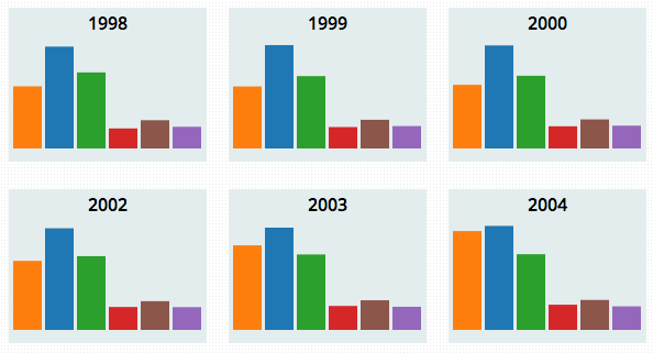
C02 Emitted Over the Years
To isolate and explain this functionality, I’ve created a small multiple visualization of CO2 emissions that incorporates much of this functionality. Check it out by clicking the image below.
The code is available on github for downloading and remixing - so you can start on your own awesome interactive small multiple today!
C02 emissions for the current leading CO2 producers are displayed for each year between 1961 and 2008. But the top polluters now weren’t always the top polluters back then. We see the steady increase in emissions in China. We see Japan struggle to maintain lower emissions in the 80’s and 90’s. We see the decadent United States, boldly and consistently dioxiding the world - especially when compared to all of the European Union.
The details on demand element of the visualization is demonstrated when you click on a plot. Each bar chart gets a zoomed in detail view, providing more details about that year. In the example, the detail view is pretty simple, but the idea is that more complex annotations and interactions can occur here to provide more insights into the data without compromising the small multiples view.
Ready to learn how to create one on your own? Let’s get started!
Above the Smog: An Overview of the Implementation
The general idea for implementing this method isn’t too tricky:
Each chart in the small multiples view is contained in its own div and its own SVG element. 48 years means 48 SVGs on the page.
The detail view is created in a separate SVG element that spans the entire display area. The elements making up the detail view start out hidden.
When a chart is clicked, the small multiple version is drawn in the detail view so that it covers up the original below it. Additional annotations are then added to the detail view version of the graphic.
Finally, D3 transitions are used to zoom the detailed chart front and center while CSS transitions are used to obscure the small multiples in the background. Clicking on the detail view essentially undos the process: a transition pulls the detailed chart back to its origin ending with the detail view being re-hidden.
Now that we have the stratospheric perspective, let’s hit a few of the more tricky details. We’ll start with some details on the underlying html and CSS - but don’t worry! We will take a hard look at the visualization implementation too.
Building our Smog Factory: Proper Positioning of DOM Elements
To make this look good, it is important to get all the elements on the page positioned correctly. We have a few things to worry about: the positioning of the small multiple graphs, the detail view overlay covering the current viewing area, and a clean transition between small multiple and detail view.
Here is the overall structure of the html that will hold both the small multiple SVGs as well as the detail view:
<div id="main" role="main">
<div id="vis">
<div id="previews"></div>
<div id="detail" class="hidden">
<div id="detail_panel">
<svg width="800" height="800">
<g id="detail_view"></g>
</svg>
</div> <!-- end #detail_panel -->
</div> <!-- end #detail -->
</div> <!-- end #vis -->
</div> <!-- end #main -->
The #previews div is where each of the charts in the small multiple view will be created. It is currently empty as will generate these divs dynamically using D3.
The detail view is a bit more complicated. The top #detail div will serve to overlay the entire view. It starts hidden so the entire detail view is not visible initially.
The #detail_panel div will be used to center the detail view SVG so that it sits on top of the small multiples view.
Inside the #detail_panel we prepare a svg element with a #detail_view group. This g node is where the detail view visualization will be drawn.
On the CSS side, there are two topics I want to hit. First, we need to get the position of the detail view figured out.
In our example, as in the original visualization, the header and footer are fixed so that they stay visible on screen as the rest of the page is scrolled. This means we also want our #detail fixed and set below our header. Here’s the CSS for the most-outer #detail div:
#detail {
  position: fixed;
  top: 128px;
  width: 100%;
  background-color: rgba(255, 255, 255, 0.5);
}
You can see I’m also using rgba CSS3 to make the background semi-transparent.
Check out the rest of the stylesheet for details on positioning of other components.
Now, let’s look at the nice CSS transition used to transition between the two views.
The MDN has a nice tutorial on CSS transistions - so I won’t go into too much detail, but I wanted to look at the how this technology is used for the subtle background effects here.
The transition is controlled by two classes .hidden and .visible. Here’s what they look like:
.hidden {
opacity: 0;
transition: opacity 500ms ease-in;
-webkit-transition: opacity 500ms ease-in;
-moz-transition: opacity 500ms ease-in;
z-index: 0 !important;
}

.visible {
opacity: 1;
transition: opacity 500ms ease-in;
-webkit-transition: opacity 500ms ease-in;
-moz-transition: opacity 500ms ease-in;
}
We will apply the .hidden class to the small multiple view when the detail view comes up. Instead of immediately disappearing, the CSS transition allows us to apply our opacity over time. When this class is applied to a div, it will gradually disappear over half a second.
Likewise, the .visible class will make the elements reappear gradually over time. A nice subtle effect with just a bit of CSS.
Year by Year: Building the Small Multiple View
Ok, enough with the layout, let’s get to the visualization! The full coffeescript code is here - and below we will walk through some of the important parts.
Coffeescript Implementation
This visualization is written in CoffeeScript . I just enjoy it so much more than Javascript, I couldn’t bear to change. I invite you to take a 20 minute look at CoffeeScript - if you aren’t already familiar. It is a really simple language and really allows us to focus on the implementation details - rather then syntax.
First up, we need to create a separate div and SVG element for each of the charts in the small multiple. We will do this by using D3’s data method to bind the data to an empty selection and then appending the needed elements.
To better understand what the code is doing, here is what the data looks like:
[
{
"year": 1961,
"values": [
{
"name": "China",
"value": 552066.85,
"percent_world": 0.059
},
{
"name": "USA",
...
}
]
},
{
"year": 1962,
...
}
...
]
So data is an array of objects. Each object represents a single year’s data. The values array of the object stores the CO2 values for each country for that year.
And here’s the code:
 # bind data to svg elements so there will be a svg for # each year
pre = d3.select(this).select("#previews")
.selectAll(".preview").data(data)

      # create the svg elements
      pre.enter()
        .append("div")
        .attr("class", "preview")
        .attr("width", width)
        .attr("height", height)

      svgs = pre.append("svg")
        .attr("width", width)
        .attr("height", height)

      # create a group for displaying the bar chart in
      previews = svgs.append("g")
There are no div’s with class .preview initially, so when we use enter() this will create a div for each year. Inside each div, we append a SVG element. Both elements share the same width and height. We will use the position information of the preview div’s to figure out where to start the detail view transition. Inside the SVG, we create a group element to draw the chart in.
Next let’s draw the actual charts. I wanted to use the same code to draw the basic chart in both the small multiples view and the detail view. To make this happen, I encapsulated the code in a function called drawChart() and then execute this function to draw all the small multiple charts by calling it through D3’s each() function:
 # draw the graphs for each data element.
previews.each(drawChart)
The each() function will execute drawChart() for each of the SVG elements .
This drawing function will be passed to arguments: the data associated with the element, and its index in the data array. Additionally, inside drawChart(), this will be the current DOM element - meaning for us the g inside each SVG element that we want to draw the chart in.
So what does drawChart() look like?
drawChart = (d,i) -> # the 'this' element is the group # element which the bar chart will # live in
base = d3.select(this)
base.append("rect")
.attr("width", graphWidth)
.attr("height", graphHeight)
.attr("class", "background")

    # create the bars
    graph = base.append("g")
    graph.selectAll(".bar")
      .data((d) -> d.values)
      .enter().append("rect")
      .attr("x", (d) -> xScale(d.name))
      .attr("y", (d) -> (graphHeight - yScale(d.value) - yPadding))
      .attr("width", xScale.rangeBand())
      .attr("height", (d) ->  yScale(d.value))
      .attr("fill", (d) -> colorScale(d.name))
      .on("mouseover", showAnnotation)
      .on("mouseout", hideAnnotation)

    # add the year title
    graph.append("text")
      .text((d) -> d.year)
      .attr("class", "title")
      .attr("text-anchor", "middle")
      .attr("x", graphWidth / 2)
      .attr("dy", "1.3em")
This is pretty standard D3 for chart creation, based on existing bar chart examples .
Again, this is the g to draw in, so we select it first and then append elements to this element.
Our d input argument is the data bound to this element - meaning the object containing data from a particular year. For each year, we want to create a bar for each Object in the values array.
As described in the documentation , we can pass a function into data to return an array inside the parent data. This is why we use .data((d) -> d.values) when creating .bar rects - to bind a new rectangle for each of the country objects in values.
As part of the bar creation, we also assign mouseover and mouseout functions. But if you interact with the demo , you will see that nothing happens when you mouse over bars while you are in the small multiples view.
So what’s going on?
After executing drawChart(), we perform one more step with our small multiple bar charts:
previews.append("rect")
.attr("width", graphWidth)
.attr("height", graphHeight)
.attr("class", "mouse_preview")
.on("click", showDetail)
This overlays a transparent rectangle on top of each small multiple. When this rect is clicked, it will execute the showDetail function. It also prevents mouse interactions from reaching the bars underneath.
With relatively little code, we can make a nice small multiples display without duplicating code.
The Dirty Details: Building the Detail View
But we’re not done yet! Let’s investigate what happens when a small multiple is clicked - by looking at showDetail(). First, the creation and drawing code:
showDetail = (d,i) -> # switch the css on which divs are hidden
toggleHidden(true)

    detailView = d3.select("#detail_view")
    detailView.selectAll('.main').remove()

    # bind the single element to be detailed to the
    # detail view's group
    detailG = detailView.selectAll('g')
      .data([d]).enter()

    # create a new group to display the graph in
    main = detailG.append("g")
      .attr("class", "main")

    # draw graph just like in the initial creation
    # of the small multiples
    main.each(drawChart)

    # add details specific to the detail view
    main.each(drawDetails)
First, toggleHidden(true) swaps the .hidden and .visible CSS classes we looked at earlier, starting the transition to fade out the background and fade in the detail view.
Then we create a new g element inside our detail view’s SVG with the class .main. We use data([d]) to bind the data as d in this function refers to a single year’s data object. We want to use all the D3 functions - even when dealing with a single object - so binding to an array containing just this element is a good way to do that.
We use the same drawChart() function to create a bar chart in the detail view SVG. This chart will be initially identical to one of the charts in the small multiple view. The drawDetails() function adds annotations to the detail view chart to make it, well… more detailed.
drawDetails = (d,i) -> # like in 'drawChart', 'this' # is the group element to draw # the details in
graph = d3.select(this)

    # add names under bars
    graph.selectAll(".name")
      .data(d.values).enter()
      .append("text")
      .attr("class", "name")
      .text((d) -> d.name)
      .attr("text-anchor", "middle")
      .attr("y", graphHeight - yPadding)
      .attr("dy", "1.3em")
      .attr("x", (d) -> xScale(d.name) + xScale.rangeBand() / 2)
      .attr("font-size", 8)

    # add values above bars
    graph.selectAll(".amount")
      .data(d.values).enter()
      .append("text")
      .attr("class", "amount")
      .text((d) -> if d.value == 0 then "No Data" else shortenNumber(d.value))
      .attr("text-anchor", "middle")
      .attr("y", (d) -> (graphHeight - yScale(d.value) - yPadding))
      .attr("dy", (d) -> if yScale(d.value) < 10 then "-0.3em" else "1.1em")
      .attr("x", (d) -> xScale(d.name) + xScale.rangeBand() / 2)
      .attr("font-size", 5)
We can see that the d, i, and this variables all behave the same as in drawChart().
Here we add text for displaying the country name and values associated with each bar.
In this simple example, we are able to re-use most of the drawChart() code and simply append more details with drawDetails(). If you were making a more extreme detail view, you might not be able create it in such an elegant manner.
An important thing to remember is that initially the detail view is the same small size as the bar charts in the small multiples.
But now its time for the big finish - like a beautify butterfly the detail view will be transformed!
I’ve left most of my comments in the code snippet - even though it takes away some of the suspense.
 # getPosition is a helper function to # return the relative location of the graph # to be viewed in the detail view
pos = getPosition(i)

    # scrollTop returns the number of pixels
    # hidden on the top of the window because of
    # the window being scrolled down
    scrollTop = $(window).scrollTop()

    # first we move our (small) detail chart to be positioned over
    # its preview version
    main.attr('transform', "translate(#{pos.left},#{pos.top - scrollTop})")

    # then we use a transition to center the detailed graph and scale it
    # up to be bigger
    main.transition()
      .delay(500)
      .duration(500)
      .attr('transform', "translate(#{40},#{0}) scale(#{scaleFactor})")
First we figure out where the small multiple that was clicked is currently in the browser’s window. Then we transition the detail view’s chart to this location immediately.
Finally, we transition the entire SVG group to create the zoom effect.
We provide both a translation position and a scaling factor. D3 does all the rest of the work. It is able to recognize numbers inside strings and automatically tween between the starting location and the final destination.
The effect is simple, but I think very effective. The intuitive and meaningful nature of the animation maintain constancy and look good to boot.
Again, the code is available on github . Please let me know what small multiples and/or details on demand you create!
And thanks again to Michael Porath for the great and inspiring Manifest Destiny visualization.